Hover
Hover
The :hover selector is used to apply styles to an element when it is being hovered over by the mouse. It allows you to add interactive effects to elements on your web page.
In the first example you provided, the HTML code is as follows:
Code :
<!DOCTYPE html>
<html lang="en">
  <head>
    <title>Hover</title>
    <style>
      .btn {
        background-color: tomato;
        color: white;
        border: 2px solid dashed;
        border-radius: 10px;
      }
      .btn:hover {
        background-color: aquamarine;
        color: black;
      }
    </style>
  </head>
  <body>
    <button class="btn">Awesome button</button>
  </body>
</html>
Output
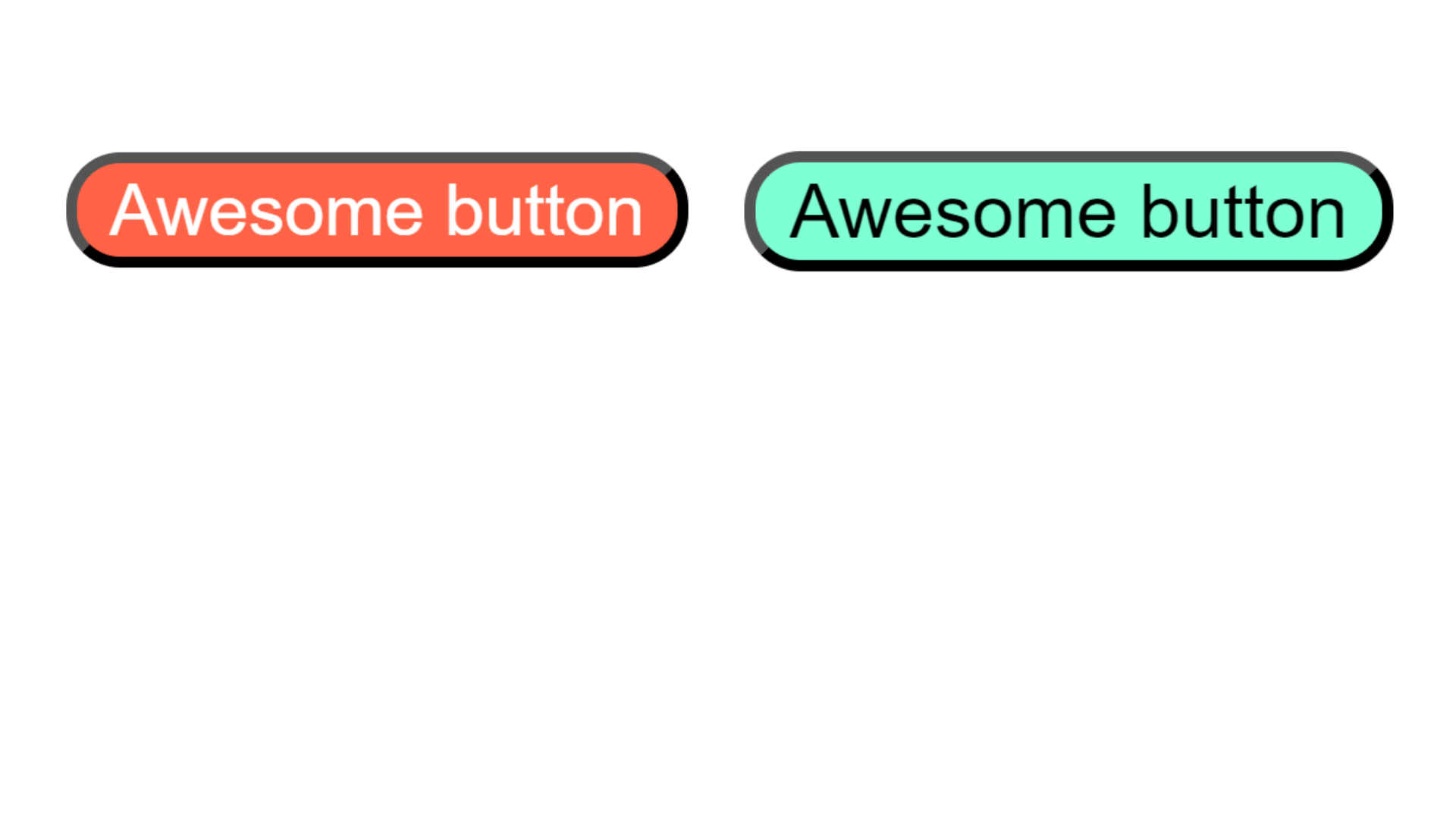
In this example, there is a button element with the class btn. The CSS styles defined for the class btn specify that the background color is tomato, the text color is white, and there is a dashed border with a 2px width and a border-radius of 10px.
The .btn:hover selector is used to define the styles that will be applied when the button is being hovered over. In this case, it changes the background color to aquamarine and the text color to black.
When you view this HTML page in a browser, the button will have the default styles defined by the .btn class. However, when you move your mouse over the button, the styles defined by the .btn:hover selector will be applied, resulting in a different background color and text color for the button.
Hover effect on image
In the second example you provided, you want to apply a hover effect to an image. Here's the code:
Example :
<!DOCTYPE html>
<html lang="en">
  <head>
    <title>shadow</title>
    <style>
      .img-tiger {
        height: 100px;
        border-radius: 50%;
      }
      .img-tiger:hover {
        border-radius: 20px;
        transition: 2s;
        margin-left: 30px;
      }
    </style>
  </head>
  <body>
    <img src="tiger.png" class="img-tiger" alt="img" />
  </body>
</html>
Output :
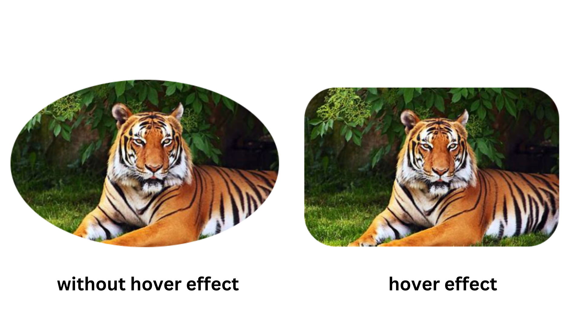
In this example, there is an image element with the class img-tiger. The CSS styles defined for the class img-tiger specify that the image should have a height of 100px and a border-radius of 50%, giving it a circular shape.
The .img-tiger:hover selector is used to define the styles that will be applied when the image is being hovered over. In this case, it changes the border-radius to 20px, making the image slightly less circular. It also adds a transition effect with a duration of 2 seconds, so the change happens gradually. Additionally, it moves the image 30px to the right by setting the margin-left property.
When you view this HTML page in a browser, the image will have the default styles defined by the .img-tiger class. However, when you move your mouse over the image, the styles defined by the .img-tiger:hover selector will be applied, resulting in a change in border-radius and a transition effect.