Box Shadow
Box-Shadow
The box-shadow property is used to add one or more shadows to an element. It allows you to create visually appealing effects, such as giving the illusion of depth or highlighting elements.
The syntax for the box-shadow property is as follows:
       h-shadow v-shadow  blur spread  color
          |       |      |      |       |
box-shadow: 5px 5px 5px 2px #808080;
h-shadow: The horizontal offset of the shadow. A positive value puts the shadow on the right side of the box, and a negative value puts the shadow on the left side.v-shadow: The vertical offset of the shadow. A positive value puts the shadow below the box, and a negative value puts the shadow above.blur: The blur radius. The higher the value, the more blurred the shadow will be.spread: The spread radius. A positive value increases the size of the shadow, and a negative value decreases the size.color: The color of the shadow.
In the third example you provided, you want to add a box shadow to an image. Here's the code:
Code :
<!DOCTYPE html>
<html lang="en">
  <head>
    <title>img shadow</title>
    <style>
      .img-tiger {
        height: 300px;
        border-radius: 50px;
        margin: 30px;
        box-shadow: 2px 2px 5px 10px rgb(138, 136, 136);
      }

      .img-tiger:hover {
        border-radius: 20px;
        transition: 2s;
      }
    </style>
  </head>

  <body>
    <img src="tiger.png" class="img-tiger" alt="img" />
  </body>
</html>
Output :
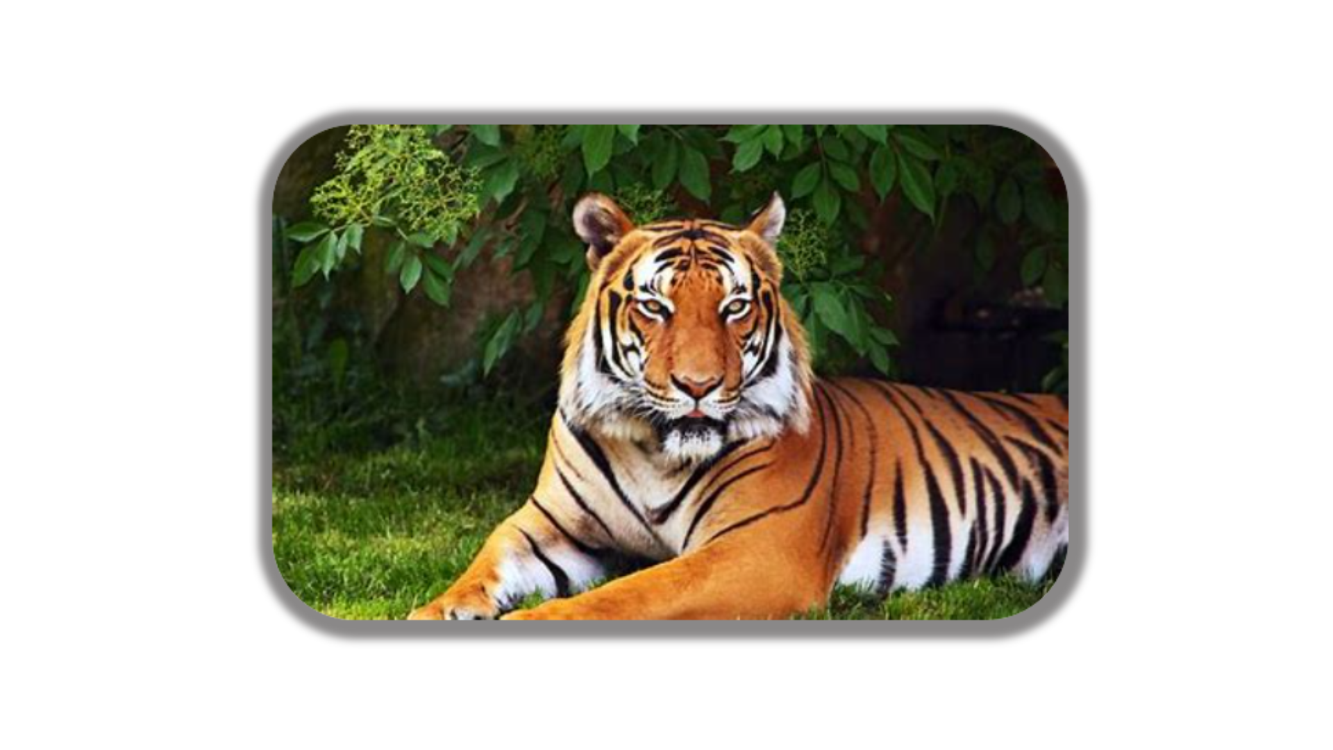
In this example, there is an image element with the class img-tiger. The CSS styles defined for the class img-tiger specify that the image should have a height of 300px, a border-radius of 50px, and a margin of 30px. The box-shadow property is used to add a shadow to the image. The values 2px 2px 5px 10px define the horizontal offset, vertical offset, blur radius, and spread radius of the shadow, respectively. The color of the shadow is specified as rgb(138, 136, 136).
When you view this HTML page in a browser, the image will have a box shadow applied to it according to the styles defined by the .img-tiger class. When you move your mouse over the image, the border-radius will change to 20px with a transition effect, as defined by the .img-tiger:hover selector.
Code :
<!DOCTYPE html>
<html lang="en">
  <head>
    <title>Button shadow</title>
    <style>
      .btn {
        background-color: aquamarine;
        border-radius: 20px;
      }
      .btn:hover {
        box-shadow: 1px 1px 2px 2px gray;
      }
    </style>
  </head>

  <body>
    <button class="btn">Click Here</button>
  </body>
</html>
Output :
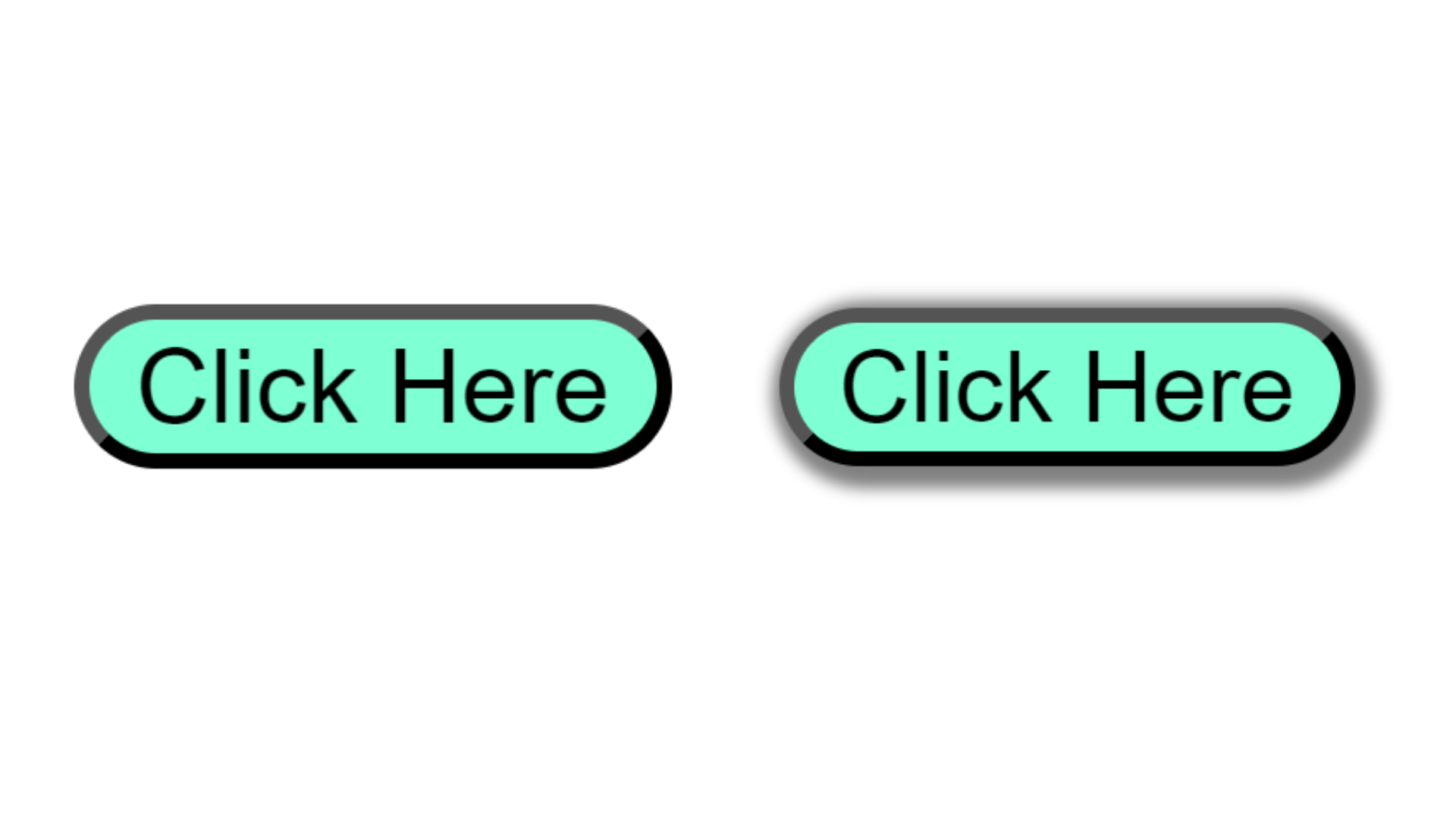
In this example, A button element with the class "btn" and the text "Click Here". The ".btn" class sets the button's background color to aquamarine and gives it rounded corners with a border-radius of 20 pixels.
The ".btn:hover" selector applies styles when the button is hovered over. It adds a gray box-shadow of 1 pixel horizontal and vertical offset, with a 2-pixel blur radius, creating a subtle shadow effect when the button is hovered.