What is Flexbox?
Flexbox stands for flexible box. To align cards flexibly inside to container. Flexbox make it simple to align items vertically and horizontally using rows and columns. Flexbox makes it easier to design a flexible responsive layout of a webpage.
We can add multiple-child items in one parent container.
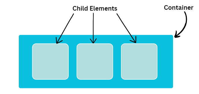
We can use the flexbox property then your first step is to create one parent division and in the parent division we create multiple child divisions.
Code :
<!DOCTYPE html>
<html>
  <head>
    <title>Flex Box</title>
    <style>
      .container {
        height: 380px;
        width: 400px;
        background-color: #0cc0df;
        padding: 5px;
        border-radius: 5px;
      }

      .item {
        background-color: #b1dddf;
        height: 100px;
        width: 100px;
        margin: 10px;
        font-size: 50px;
        padding: 5px;
        border-radius: 10px;
        border: solid 1px white;
      }
    </style>
  </head>

  <body>
    <div class="container">
      <div class="item">1</div>
      <div class="item">2</div>
      <div class="item">3</div>
    </div>
  </body>
</html>
Output :
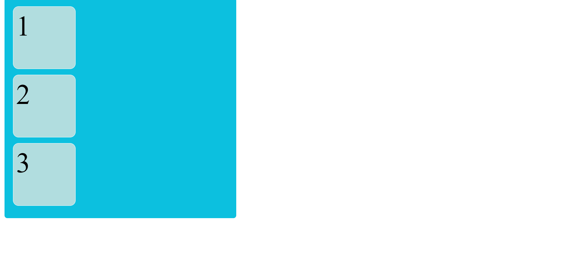
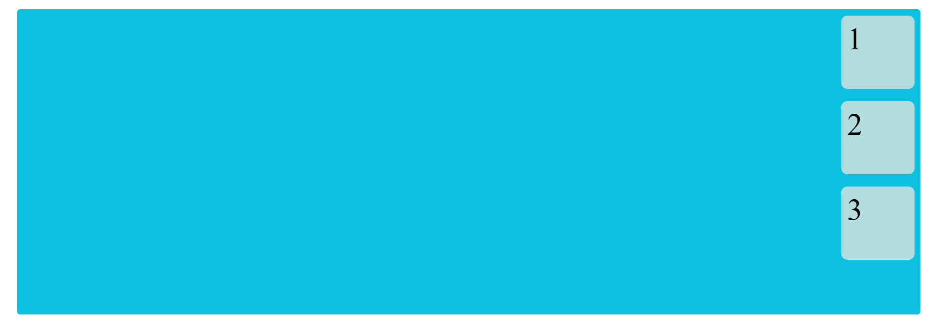
Now, we implement flexbox. If you implement the flexbox property then give the effect of the parent division, not a child.
Code :
<!DOCTYPE html>
<html>
  <head>
    <title>Flex Box</title>
    <style>
      .item {
        background-color: #b1dddf;
        height: 100px;
        width: 100px;
        margin: 10px;
        font-size: 50px;
        padding: 10px;
        border-radius: 10px;
        border: solid 1px white;
      }

      .container {
        height: 380px;
        width: 400px;
        display: flex;
        background-color: #0cc0df;
        padding: 5px;
        border-radius: 5px;
      }
    </style>
  </head>

  <body>
    <div class="container">
      <div class="item">1</div>
      <div class="item">2</div>
      <div class="item">3</div>
    </div>
  </body>
</html>
Output :
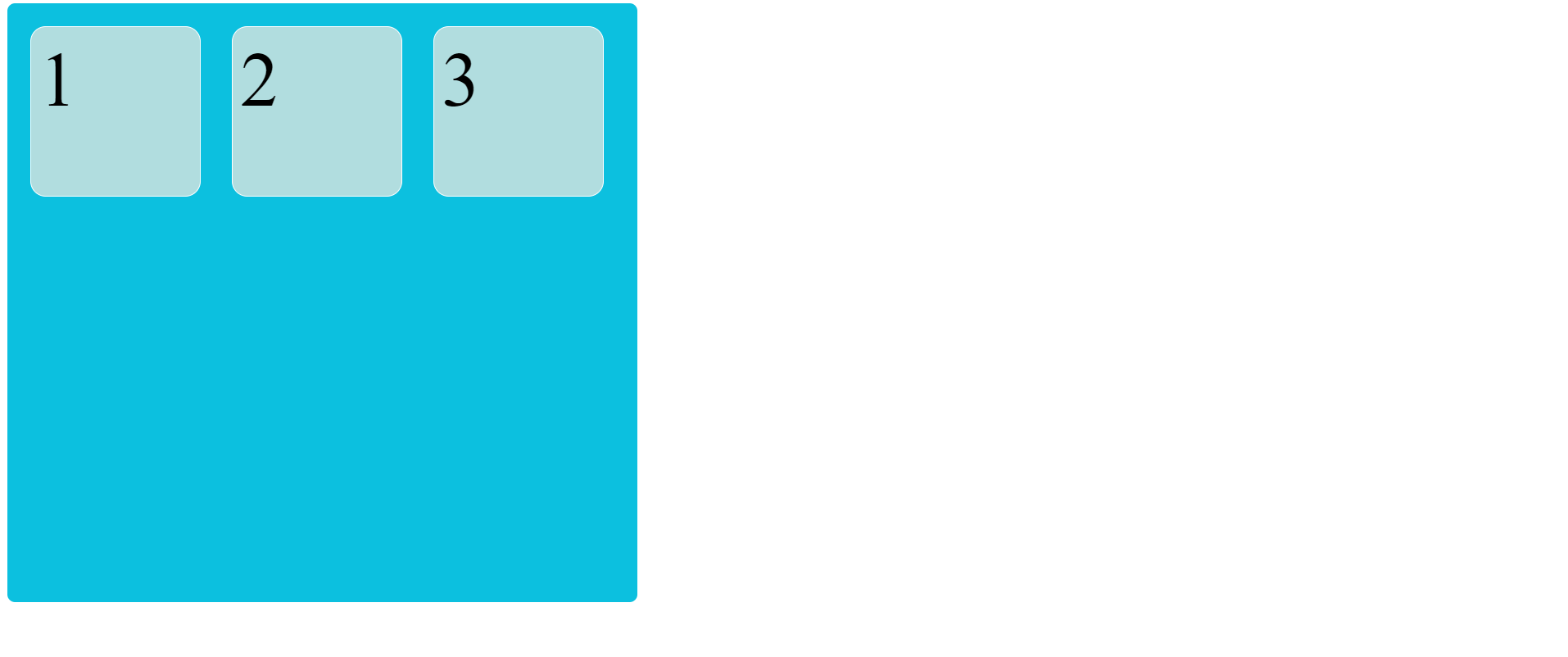
In the above example, we only give one class to parents division and add the effect on parent division display: flex then your parent division are made a flexbox.
This display: flex property defines a flex container. It enables a flex context for all it's children.
flex-direction
Flex direction are used to define the direction of child item are placed in the flex container.
There are four flex direction are available.
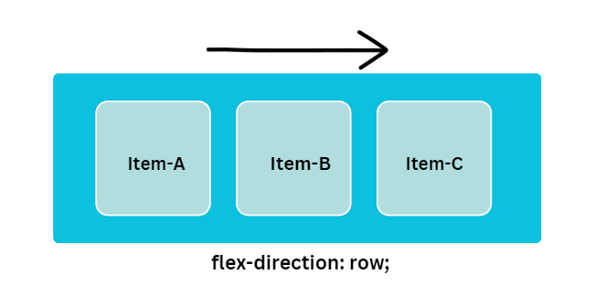
flex-direction: row;
By default, the direction is a row. Child items are Left to Right direction.
Code :
<!DOCTYPE html>
<html>
  <head>
    <title>Flex Box</title>
    <style>
      .item {
        height: 100px;
        width: 100px;
        background-color: #b1dddf;
        margin: 10px;
        font-size: 50px;
        padding: 10px;
      }

      .container {
        height: 380px;
        width: 900px;
        background-color: #0cc0df;
        padding: 5px;
        border-radius: 5px;
        display: flex;
        flex-direction: row;
      }
    </style>
  </head>

  <body>
    <div class="container">
      <div class="item">1</div>
      <div class="item">2</div>
      <div class="item">3</div>
    </div>
  </body>
</html>
Output :
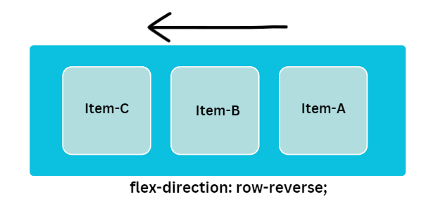
flex-direction: row-reverse;
In this direction, child items are in Right to Left direction.
Code :
<!DOCTYPE html>
<html>
  <head>
    <title>Flex Box</title>
    <style>
      .item {
        height: 100px;
        width: 100px;
        background-color: #b1dddf;
        margin: 10px;
        font-size: 50px;
        padding: 5px;
        border-radius: 10px;
        border: solid 1px white;
      }

      .container {
        height: 380px;
        width: 400px;
        background-color: #0cc0df;
        padding: 5px;
        border-radius: 5px;
        display: flex;
        flex-direction: row-reverse;
      }
    </style>
  </head>

  <body>
    <div class="container">
      <div class="item">1</div>
      <div class="item">2</div>
      <div class="item">3</div>
    </div>
  </body>
</html>
Output :
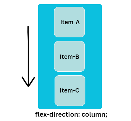
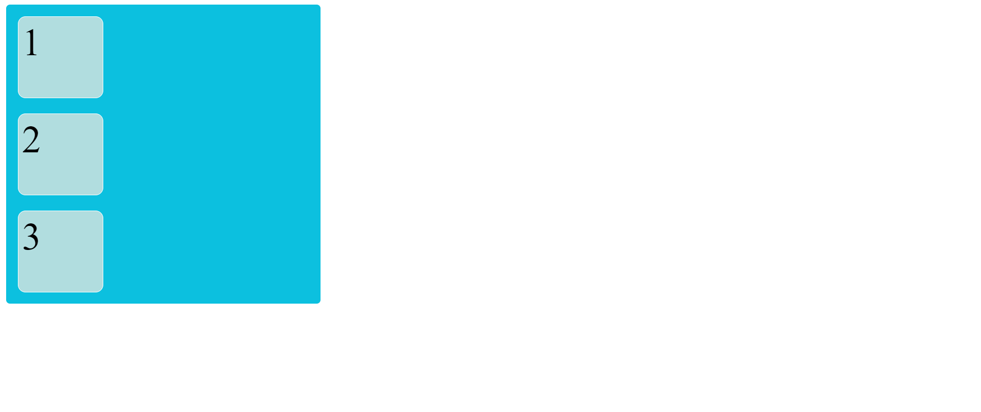
flex-direction: column;
In this direction, child items are Top to Bottom direction.
Code :
<!DOCTYPE html>
<html>
  <head>
    <title>Flex Box</title>
    <style>
      .item {
        height: 100px;
        width: 100px;
        background-color: #b1dddf;
        margin: 10px;
        font-size: 50px;
        padding: 5px;
        border-radius: 10px;
        border: solid 1px white;
      }

      .container {
        height: 380px;
        width: 400px;
        background-color: #0cc0df;
        display: flex;
        flex-direction: column;
        padding: 5px;
        border-radius: 5px;
      }
    </style>
  </head>

  <body>
    <div class="container">
      <div class="item">1</div>
      <div class="item">2</div>
      <div class="item">3</div>
    </div>
  </body>
</html>
Output :
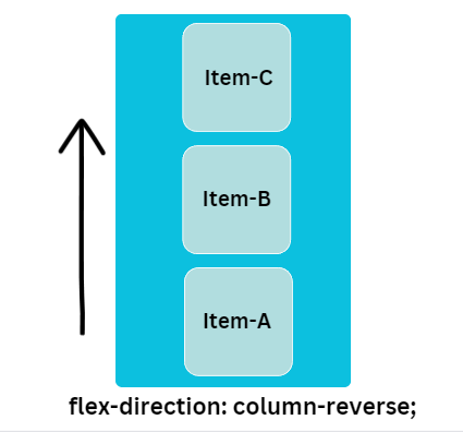
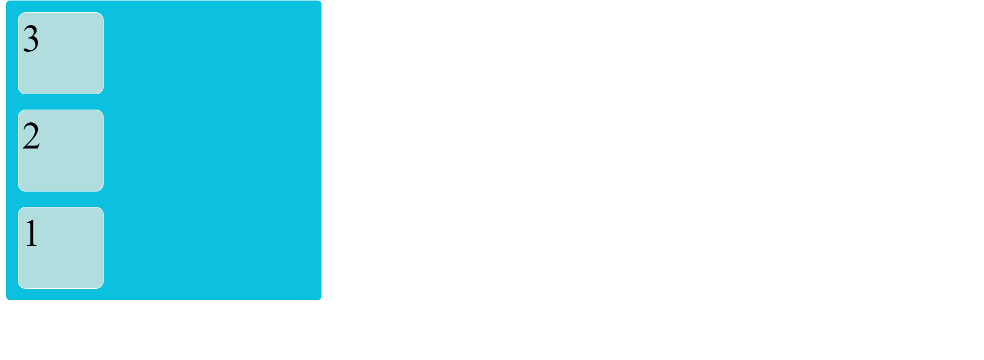
flex-direction: column-reverse;
In this direction, child items are Bottom to Top direction.
Code :
<!DOCTYPE html>
<html>
  <head>
    <title>Flex Box</title>
    <style>
      .item {
        height: 100px;
        width: 100px;
        background-color: #b1dddf;
        margin: 10px;
        font-size: 50px;
        padding: 5px;
        border-radius: 10px;
        border: solid 1px white;
      }

      .container {
        display: flex;
        flex-direction: column-reverse;
        height: 380px;
        width: 400px;
        background-color: #0cc0df;
        padding: 5px;
        border-radius: 5px;
      }
    </style>
  </head>

  <body>
    <div class="container">
      <div class="item">1</div>
      <div class="item">2</div>
      <div class="item">3</div>
    </div>
  </body>
</html>
Output :
justify-content
justify-content property defines the alignment of the child item. If the direction is row the justify-content property applies horizontally and if the direction is column then it applies vertically.
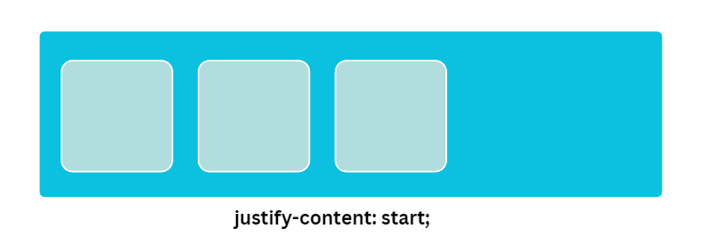
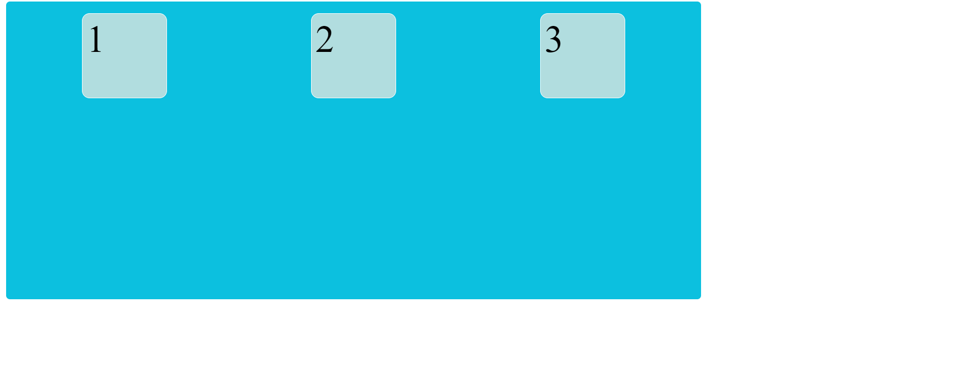
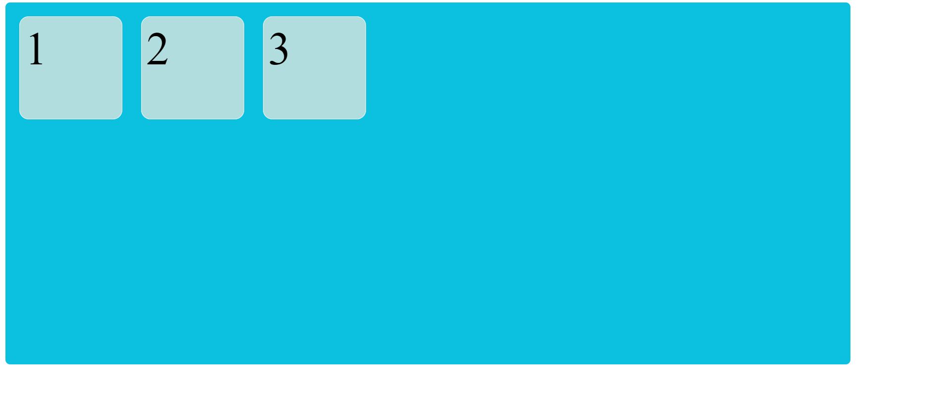
justify-content: start;
It is a default value. Child items are packed start of the flex-direction.
Code :
<!DOCTYPE html>
<html>
  <head>
    <title>Flex Box</title>
    <style>
      .item {
        height: 100px;
        width: 100px;
        margin: 10px;
        background-color: #b1dddf;
        font-size: 50px;
        padding: 5px;
        border-radius: 10px;
        border: solid 1px white;
      }

      .container {
        height: 380px;
        width: 900px;
        background-color: #0cc0df;
        display: flex;
        flex-direction: row;
        justify-content: start;
        padding: 5px;
        border-radius: 5px;
      }
    </style>
  </head>

  <body>
    <div class="container">
      <div class="item">1</div>
      <div class="item">2</div>
      <div class="item">3</div>
    </div>
  </body>
</html>
Output :

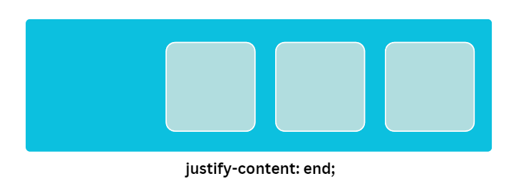
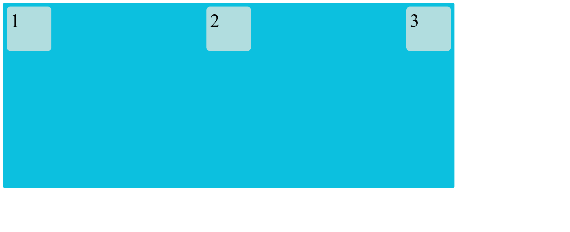
justify-content: end;
In this direction, child items are packed end of the flex-direction.
Code :
<!DOCTYPE html>
<html>
  <head>
    <title>Flex Box</title>
    <style>
      .item {
        height: 100px;
        width: 100px;
        background-color: #b1dddf;
        margin: 10px;
        font-size: 50px;
        padding: 5px;
        border-radius: 10px;
        border: solid 1px white;
      }

      .container {
        height: 380px;
        width: 900px;
        background-color: #0cc0df;
        display: flex;
        flex-direction: row;
        justify-content: end;
        padding: 5px;
        border-radius: 5px;
      }
    </style>
  </head>

  <body>
    <div class="container">
      <div class="item">1</div>
      <div class="item">2</div>
      <div class="item">3</div>
    </div>
  </body>
</html>
Output :
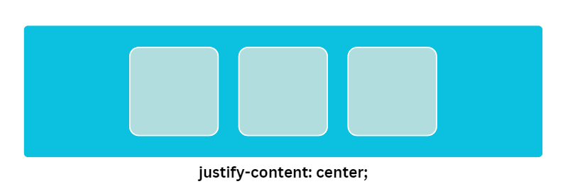
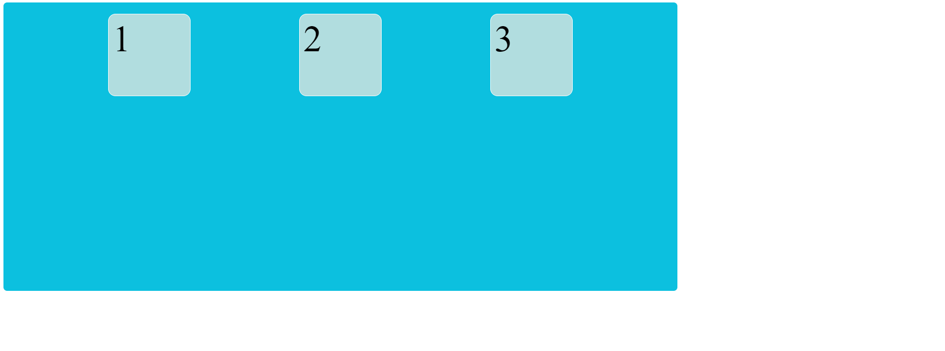
justify-content: center;
In this direction, child items are center along the line.
Code :
<!DOCTYPE html>
<html>
  <head>
    <title>Flex Box</title>
    <style>
      .item {
        height: 100px;
        width: 100px;
        background-color: #b1dddf;
        margin: 10px;
        font-size: 50px;
        padding: 5px;
        border-radius: 10px;
        border: solid 1px white;
      }

      .container {
        height: 380px;
        width: 900px;
        background-color: #0cc0df;
        display: flex;
        flex-direction: row;
        justify-content: center;
        padding: 5px;
        border-radius: 5px;
      }
    </style>
  </head>

  <body>
    <div class="container">
      <div class="item">1</div>
      <div class="item">2</div>
      <div class="item">3</div>
    </div>
  </body>
</html>
Output :
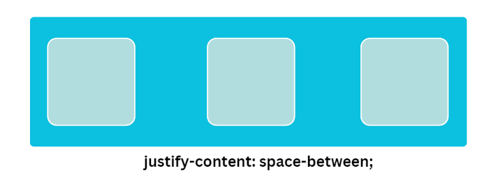
justify-content: space-between;
Child items are evenly distributed in the line.It does not provide space in side but it provide equal space between all items.
Code :
<!DOCTYPE html>
<html>
  <head>
    <title>Flex Box</title>
    <style>
      .item {
        height: 100px;
        width: 100px;
        background-color: tomato;
        margin: 10px;
        font-size: 50px;
        padding: 10px;
      }
      .container {
        background-color: aqua;
        display: flex;
        flex-direction: row;
        justify-content: space-between;
      }
    </style>
  </head>

  <body>
    <div class="container">
      <div class="item">1</div>
      <div class="item">2</div>
      <div class="item">3</div>
    </div>
  </body>
</html>
Output :
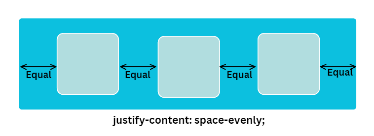
justify-content: space-evenly;
In this direction, child items are distributed so that the spacing between any two items are equal.
Code :
<!DOCTYPE html>
<html>
  <head>
    <title>Flex Box</title>
    <style>
      .item {
        height: 100px;
        width: 100px;
        background-color: #b1dddf;
        margin: 10px;
        font-size: 50px;
        padding: 5px;
        border-radius: 10px;
        border: solid 1px white;
      }

      .container {
        height: 380px;
        width: 900px;
        background-color: #0cc0df;
        padding: 5px;
        border-radius: 5px;
        display: flex;
        flex-direction: row;
        justify-content: space-evenly;
      }
    </style>
  </head>

  <body>
    <div class="container">
      <div class="item">1</div>
      <div class="item">2</div>
      <div class="item">3</div>
    </div>
  </body>
</html>
Output :
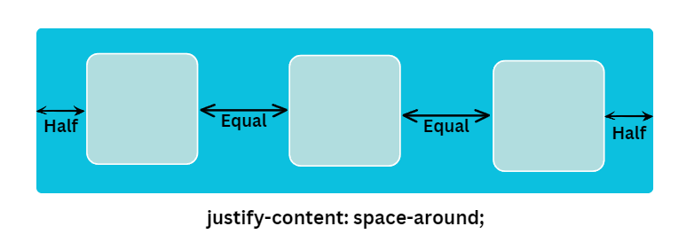
justify-content: space-around;
Child items are evenly distributed within the alignment container. In the space-around, only the inner items will have equal spacing in between each other. The first and last items will only be allocated half the spacing.
Code :
<!DOCTYPE html>
<html>
  <head>
    <title>Flex Box</title>
    <style>
      .item {
        background-color: tomato;
        height: 100px;
        width: 100px;
        margin: 10px;
        font-size: 50px;
        padding: 10px;
      }
      .container {
        background-color: aqua;
        display: flex;
        flex-direction: row;
        justify-content: space-around;
      }
    </style>
  </head>

  <body>
    <div class="container">
      <div class="item">1</div>
      <div class="item">2</div>
      <div class="item">3</div>
    </div>
  </body>
</html>
Output :
align-items
When the flex-direction is a row then justify-content control horizontally. This means the X-axis but you can control the opposite axis. This means the Y-axis then you use the property align-items. Align items are used to control items on the opposite axis.
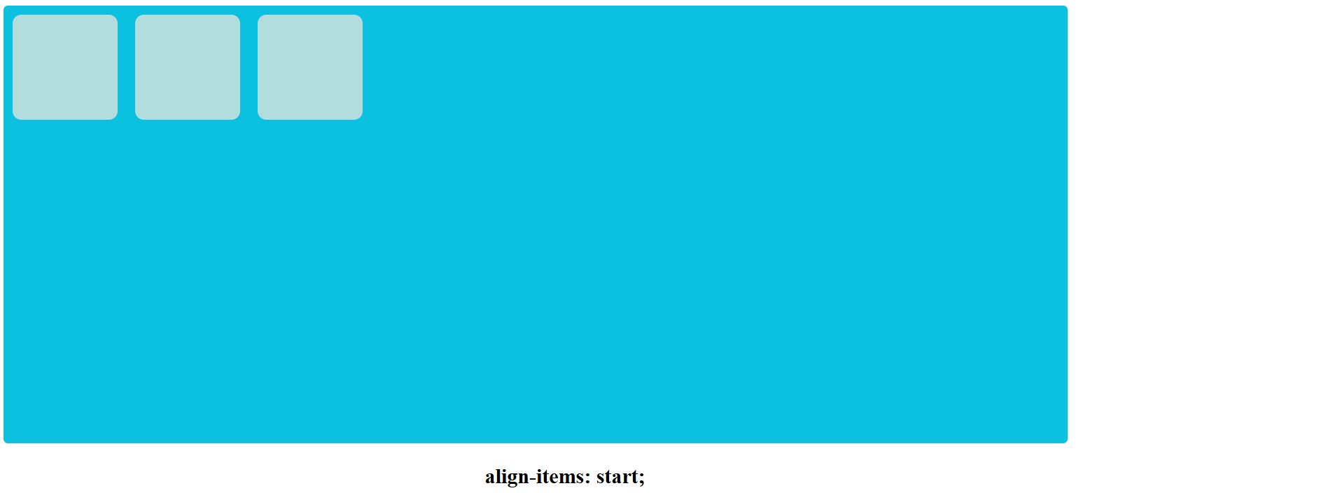
align-items: start;
Items are placed at the start of the Opposite (Y-axis) axis.
Code :
<!DOCTYPE html>
<html>
  <head>
    <title>Flex Box</title>
    <style>
      .item {
        background-color: tomato;
        height: 100px;
        width: 100px;
        margin: 10px;
        font-size: 50px;
        padding: 5px;
      }

      .container {
        height: 300px;
        width: 600px;
        background-color: aqua;
        display: flex;
        flex-direction: row;
        align-items: start;
      }
    </style>
  </head>

  <body>
    <div class="container">
      <div class="item">1</div>
      <div class="item">2</div>
      <div class="item">3</div>
    </div>
  </body>
</html>
Output :
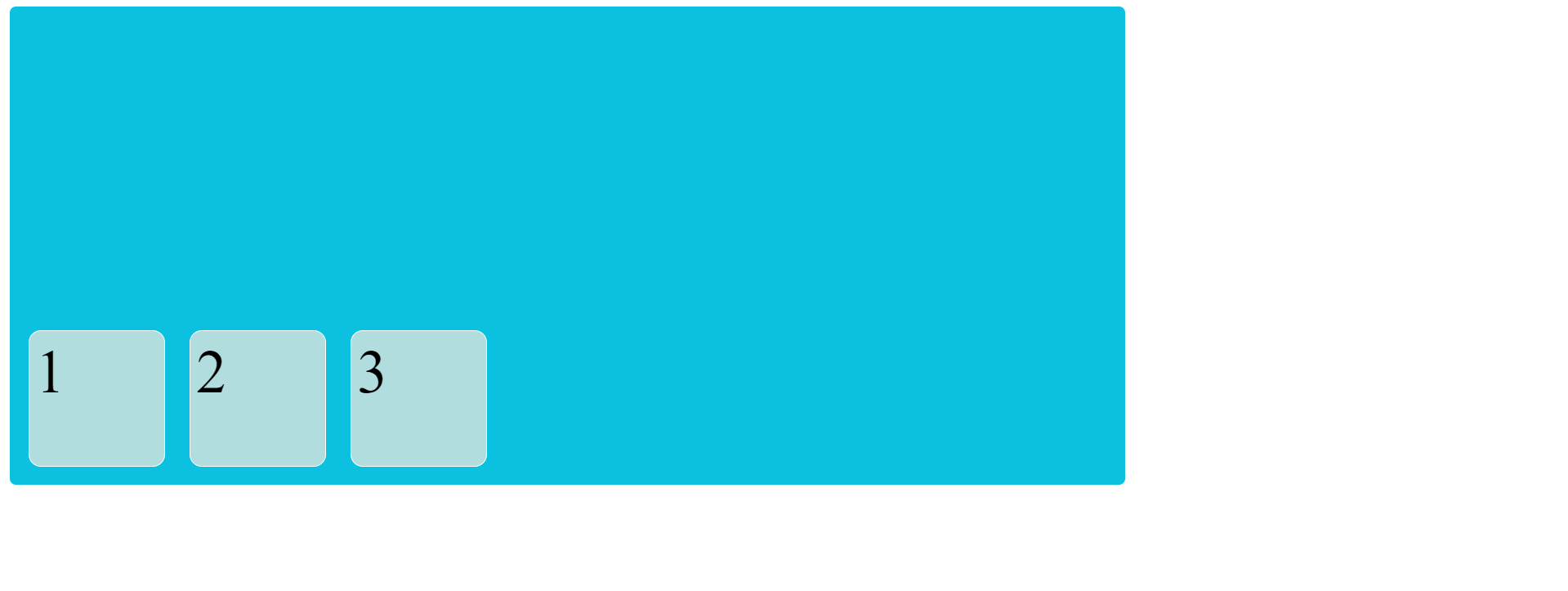
align-item: end;
Items are placed at the end of the Opposite (Y-axis) axis.
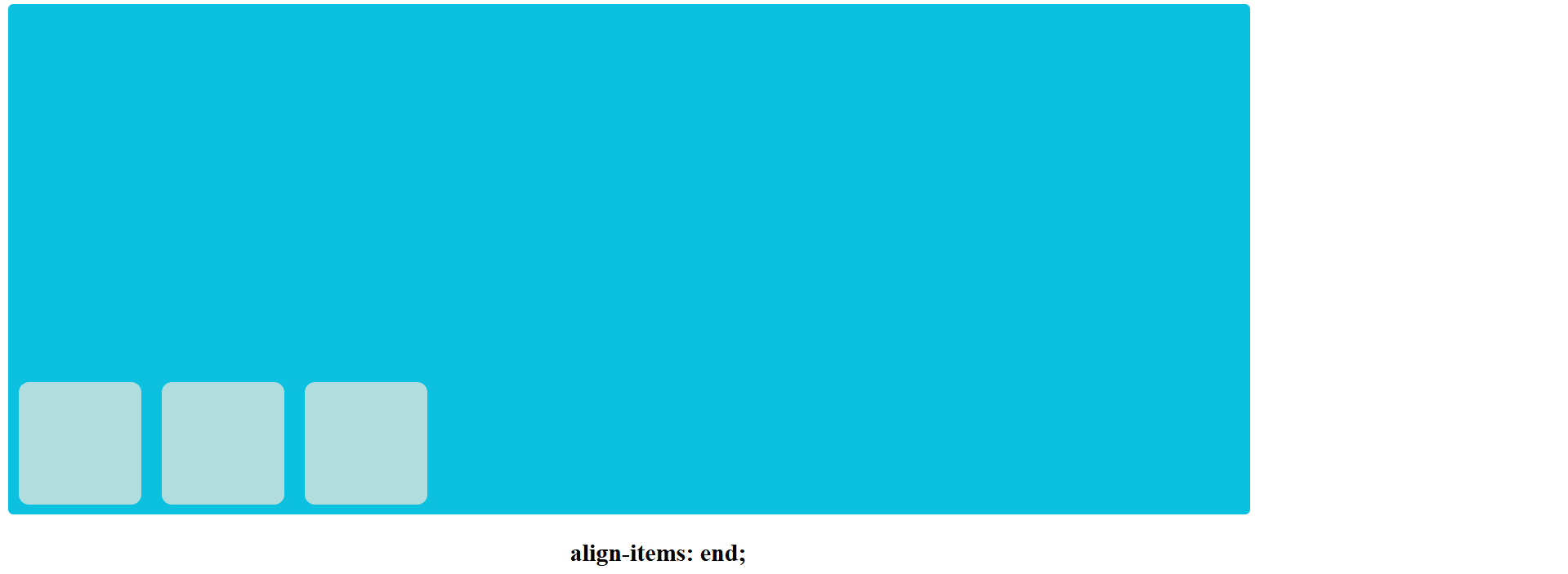
Code :
<!DOCTYPE html>
<html>
  <head>
    <title>Flex Box</title>
    <style>
      .item {
        background-color: #b1dddf;
        height: 100px;
        width: 100px;
        margin: 10px;
        font-size: 50px;
        padding: 5px;
        border-radius: 10px;
        border: solid 1px white;
      }

      .container {
        height: 380px;
        width: 900px;
        background-color: #0cc0df;
        padding: 5px;
        border-radius: 5px;
        display: flex;
        flex-direction: row;
        align-items: end;
      }
    </style>
  </head>

  <body>
    <div class="container">
      <div class="item">1</div>
      <div class="item">2</div>
      <div class="item">3</div>
    </div>
  </body>
</html>
Output :
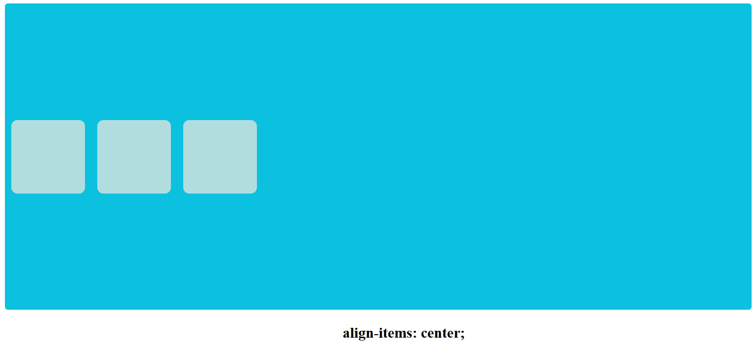
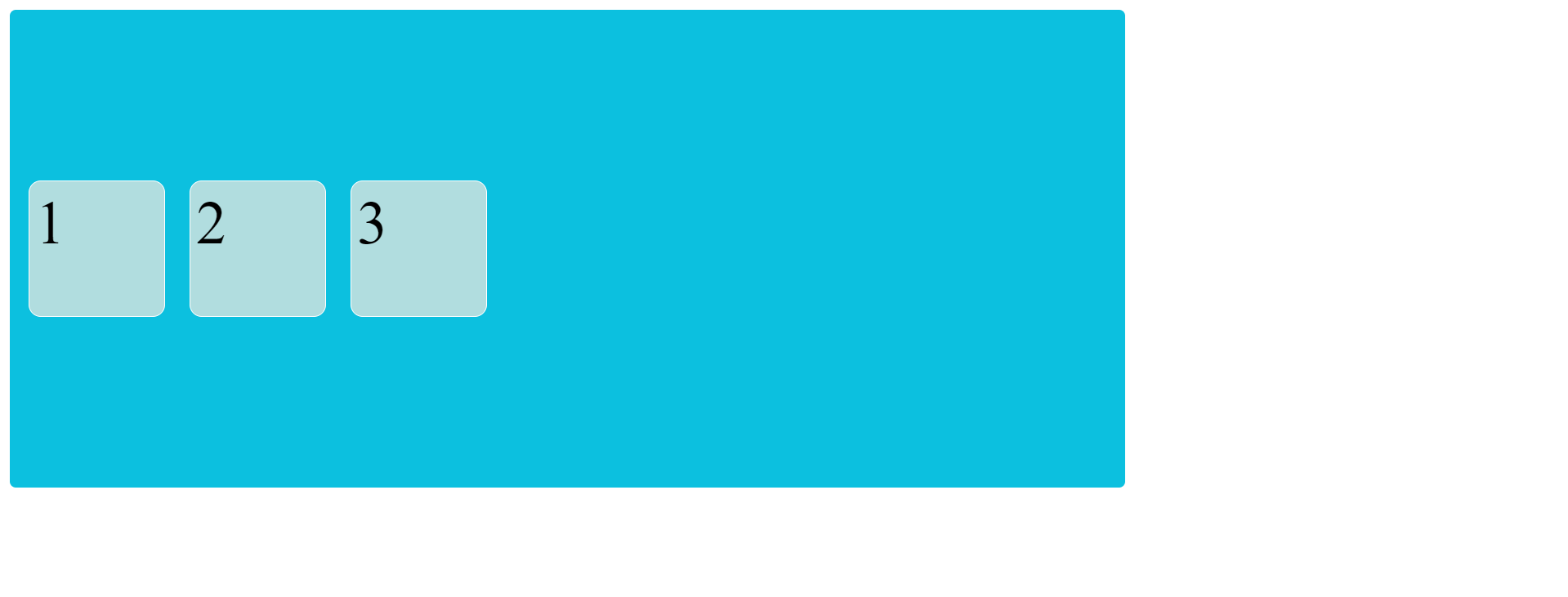
align-item: center;
Items are centered in the Opposite axis.
Code :
<!DOCTYPE html>
<html>
  <head>
    <title>Flex Box</title>
    <style>
      .item {
        background-color: tomato;
        height: 100px;
        width: 100px;
        margin: 10px;
        font-size: 50px;
        padding: 10px;
      }
      .container {
        background-color: aqua;
        display: flex;
        flex-direction: row;
        justify-content: center;
        align-items: center;
        height: 500px;
      }
    </style>
  </head>

  <body>
    <div class="container">
      <div class="item">1</div>
      <div class="item">2</div>
      <div class="item">3</div>
    </div>
  </body>
</html>
Output :
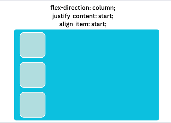
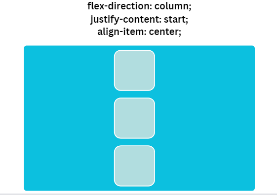
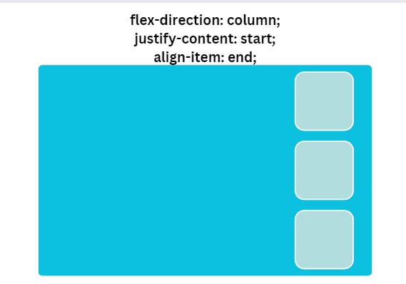
When the value of flex-direction is set to column, the justify-content property controls the vertical alignment of items. This refers to the Y axis, but you can also control the opposite axis (X axis) using the align-items property.
<!DOCTYPE html>
<html>
  <head>
    <title>Flex Box</title>
    <style>
      .item {
        background-color: #b1dddf;
        border-radius: 10px;
        height: 100px;
        width: 100px;
        margin: 10px;
        font-size: 50px;
        padding: 10px;
      }
      .container {
        background-color: #0cc0df;
        display: flex;
        flex-direction: column;
        justify-content: start;
        align-items: start;
        height: 500px;
        border-radius: 5px;
        margin: 20px;
      }
    </style>
  </head>

  <body>
    <div class="container">
      <div class="item">1</div>
      <div class="item">2</div>
      <div class="item">3</div>
    </div>
  </body>
</html>
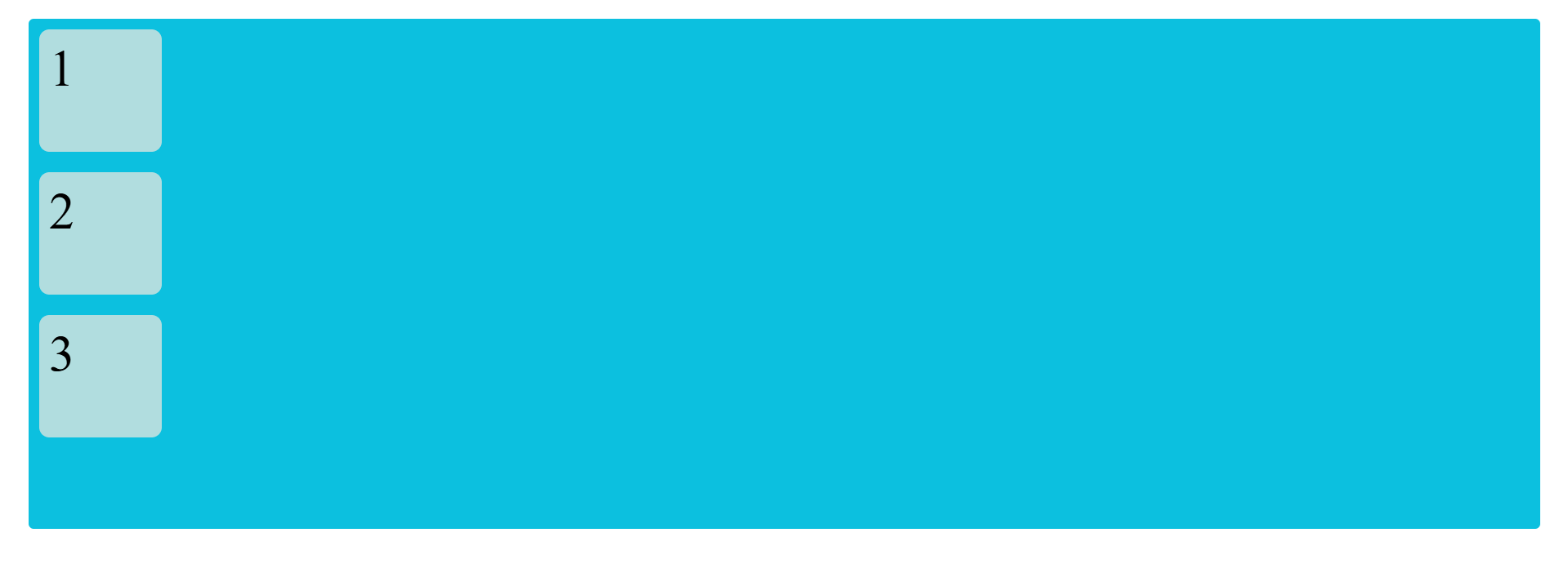
Output :
<!DOCTYPE html>
<html>
  <head>
    <title>Flex Box</title>
    <style>
      .item {
        background-color: #b1dddf;
        border-radius: 10px;
        height: 100px;
        width: 100px;
        margin: 10px;
        font-size: 50px;
        padding: 10px;
      }
      .container {
        background-color: #0cc0df;
        display: flex;
        flex-direction: column;
        justify-content: start;
        align-items: center;
        height: 500px;
        border-radius: 5px;
        margin: 20px;
      }
    </style>
  </head>

  <body>
    <div class="container">
      <div class="item">1</div>
      <div class="item">2</div>
      <div class="item">3</div>
    </div>
  </body>
</html>
Output :

<!DOCTYPE html>
<html>
  <head>
    <title>Flex Box</title>
    <style>
      .item {
        background-color: #b1dddf;
        border-radius: 10px;
        height: 100px;
        width: 100px;
        margin: 10px;
        font-size: 50px;
        padding: 10px;
      }
      .container {
        background-color: #0cc0df;
        display: flex;
        flex-direction: column;
        justify-content: start;
        align-items: end;
        height: 500px;
        border-radius: 5px;
        margin: 20px;
      }
    </style>
  </head>

  <body>
    <div class="container">
      <div class="item">1</div>
      <div class="item">2</div>
      <div class="item">3</div>
    </div>
  </body>
</html>
Output :
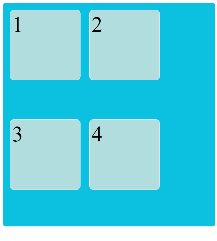
Flex-wrap
This is a simple HTML and CSS example demonstrating the use of Flexbox with the flex-wrap property. Flexbox is a powerful layout system in CSS that allows for easy arrangement and alignment of elements within a container. The flex-wrap property specifically controls how flex items are displayed and wrapped when there is not enough space to fit all the items on a single line.
Flex-Wrap Property:
The flex-wrap property accepts three values:
nowrap (default): This value indicates that all flex items should be displayed on a single line, regardless of the available space.wrap: This value indicates that the flex items should wrap onto multiple lines when there is not enough space horizontally. The items will stack vertically in this case.wrap-reverse: This value is similar towrap, but it causes the flex items to wrap in reverse order, meaning they will stack vertically in reverse order from the normal flow.
Code :
<!DOCTYPE html>
<html>
  <head>
    <title>Flex Box</title>
    <style>
      .conatiner {
        height: 500px;
        background-color: aqua;
        display: flex;
        flex-wrap: wrap;
        background-color: #0cc0df;
        padding: 5px;
        border-radius: 5px;
      }

      .item {
        background-color: #b1dddf;
        height: 150px;
        width: 150px;
        margin: 10px;
        font-size: 50px;
        padding: 5px;
        border-radius: 10px;
        border: solid 1px white;
      }
    </style>
  </head>

  <body>
    <div class="conatiner">
      <div class="item">1</div>
      <div class="item">2</div>
      <div class="item">3</div>
      <div class="item">4</div>
    </div>
  </body>
</html>
Output :
In the 1st output, set all the items on a single line.
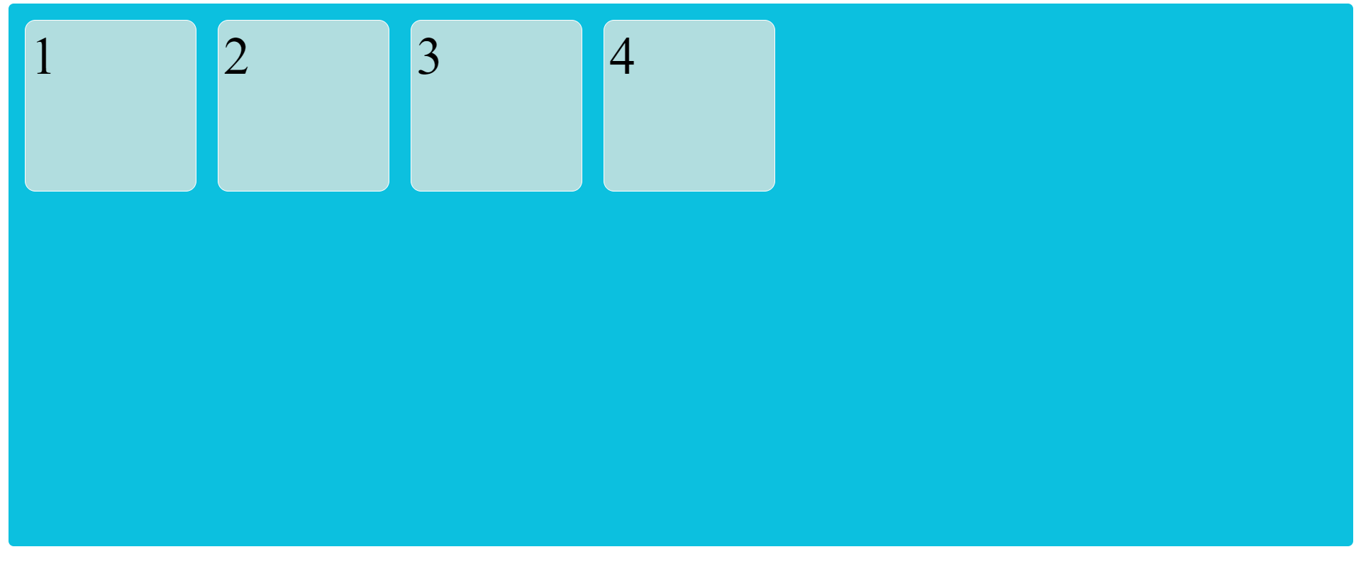
In the 2nd output, if the container does not have enough space to set all the items on a single line, the items will wrap on the next line.
The flex-wrap property is commonly used in combination with other flexbox properties like flex-direction, justify-content, and align-items to create responsive and flexible layouts.
It is helpful for responsive designs on different screens.