Border and Border Radius
Border
A border is a decorative or structural element that can be added to HTML elements to visually separate them from other elements. It is a line that surrounds the content of an element and can be customized in terms of color, width, and style.
In CSS, you can use different properties to define the border of an element:
border-styledefines the style of the border line.border-colorsets the color of the border.border-widthsets the thickness or width of the border.
Here's an example of the syntax to set the border properties:
selector {
  border-style: solid;
  border-color: aqua;
  border-width: 5px;
}
The code you provided is used to style the border of an HTML element. It has three properties that control different aspects of the border: border-style, border-color, and border-width.
border-style: solid;: This line of code sets the style of the border tosolid. Think of it as drawing a continuous line around the element. There are other styles available likedashed lines,dotted lines, and more, but here we are using asolidline.border-color: aqua;: This line of code determines thecolorof theborder. In this case, it sets theborder colortoaqua, which is a light blue color. You can choose any color you like by replacingaquawith the color of your choice.border-width: 5px;: This line of code sets thethicknessorwidthof theborder. The value5pxmeans that the border will have a width of5 pixels. You can change this value to make the border thicker or thinner as desired.
There are four types of border styles you can use:
solid: Creates a continuous line.👉**___**double: Creates two parallel lines. 👉 ====dashed: Creates a series of short dashes. 👉 ------dotted: Creates a series of small dots.👉 ..........
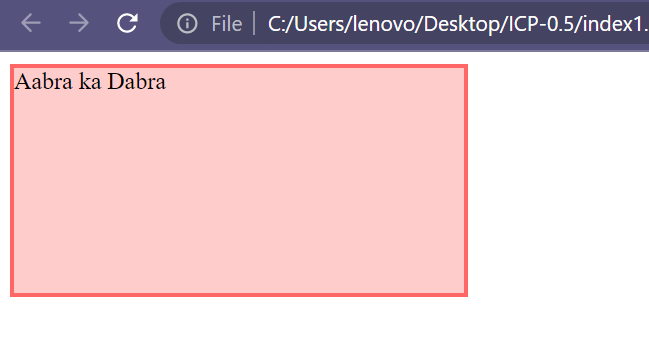
Solid Border
The solid border style creates a solid line around an element. You can apply it to different HTML elements such as div, paragraphs, headings, buttons, and images.
Implemented via using border-style: solid;
EHere's an example :
<!DOCTYPE html>
<html>
  <head>
    <title>Solid Border</title>
    <style>
      .box {
        background-color: #ffcccc;
        height: 150px;
        width: 300px;
        border-style: solid;
        border-width: 3px;
        border-color: #ff6666;
      }
    </style>
  </head>
  <body>
    <div class="box">Aabra ka Dabra</div>
  </body>
</html>
Output :
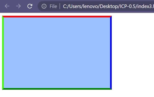
Different Border Colors for Different Sides
You can apply different border colors to different sides of an element using the properties border-left, border-right, border-top, and border-bottom.
Here's an example :
<!DOCTYPE html>
<html>
  <head>
    <title>Border</title>
    <style>
      .box {
        height: 200px;
        width: 300px;
        background-color: #99c2ff;
        border: solid 4px;
        border-left: 5px solid rgb(68, 255, 0);
        border-top: 5px solid red;
        border-right: 5px solid blue;
        border-bottom: 5px solid green;
      }
    </style>
  </head>
  <body>
    <div class="box"></div>
  </body>
</html>
Output :
Double Border
The double border style features two parallel lines surrounding an HTML element.
Implemented via using border-style: double;
Here's an example:
<!DOCTYPE html>
<html>
  <head>
    <title>Double Border</title>
    <style>
      .box {
        background-color: yellow;
        height: 200px;
        width: 300px;
        border-style: double;
        border-color: black;
        border-width: 10px;
      }
    </style>
  </head>
  <body>
    <div class="box"></div>
  </body>
</html>
Output :
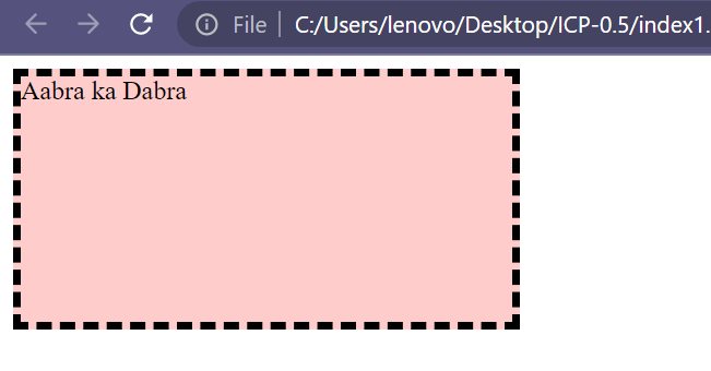
Dashed Border
The dashed border style consists of a series of short, dashed lines.
Implemented via using border-style: dashed;
Here's an example :
<!DOCTYPE html>
<html>
  <head>
    <title>Dashed Border</title>
    <style>
      .box {
        background-color: yellow;
        height: 200px;
        width: 300px;
        border-style: dashed;
        border-color: black;
        border-width: 10px;
      }
    </style>
  </head>
  <body>
    <div class="box"></div>
  </body>
</html>
Output :
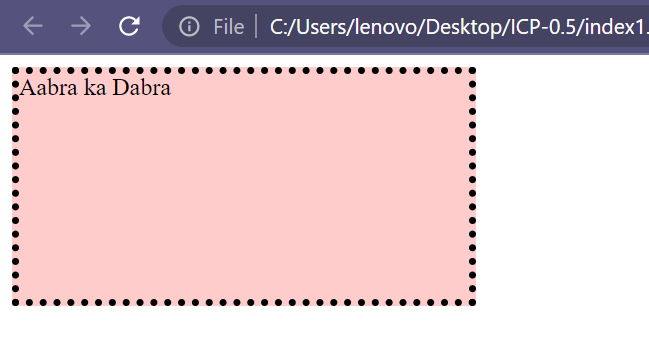
Dotted Border
The dotted border style consists of a series of dots.
Implemented via using border-style: dotted;
Here's an example :
<!DOCTYPE html>
<html>
  <head>
    <title>Dotted Border</title>
    <style>
      .box {
        background-color: yellow;
        height: 200px;
        width: 300px;
        border-style: dotted;
        border-color: black;
        border-width: 10px;
      }
    </style>
  </head>
  <body>
    <div class="box"></div>
  </body>
</html>
Output :
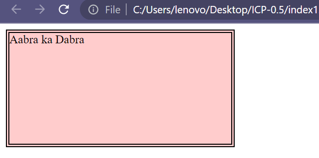
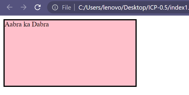
Instead of adding border-style, border-width, and border-color separately, you can use a shorthand property border to provide all values at once. For example, border: solid black 3px; will set a solid border with black color and a width of 3 pixels.
Here's an example :
<!DOCTYPE html>
<html>
  <head>
    <title>Border</title>
    <style>
      .box {
        background-color: pink;
        height: 150px;
        width: 300px;
        border: solid black 3px;
      }
    </style>
  </head>
  <body>
    <div class="box">Aabra ka Dabra</div>
  </body>
</html>
Output :
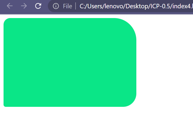
Border Radius
The border-radius CSS property is used to round the corners of an element's outer border edge. It provides a way to give elements a rounded appearance.
You can provide up to four values to the border-radius property:
border-radius: 0px 50px 0px 50px;
- The first value applies to the top-left corner.
- The second value applies to the top-right corner.
- The third value applies to the bottom-right corner.
- The fourth value applies to the bottom-left corner.
You can also provide different values for different corners
Example :
<!DOCTYPE html>
<html>
  <head>
    <title>Border Radius</title>
    <style>
      .box {
        height: 200px;
        width: 300px;
        background-color: rgb(10, 230, 135);
        border-radius: 15px 50px 30px 5px;
      }
    </style>
  </head>
  <body>
    <div class="box"></div>
  </body>
</html>
Output :
Additionally, you can use border-radius to create a circular shape by setting a value of 50%.
Here's an example:
<!DOCTYPE html>
<html>
  <head>
    <title>Border Radius</title>
    <style>
      .box {
        height: 200px;
        width: 200px;
        border: solid 2px black;
        background-color: rgb(230, 10, 204);
        border-radius: 50%;
      }
    </style>
  </head>
  <body>
    <div class="box"></div>
  </body>
</html>
Output :
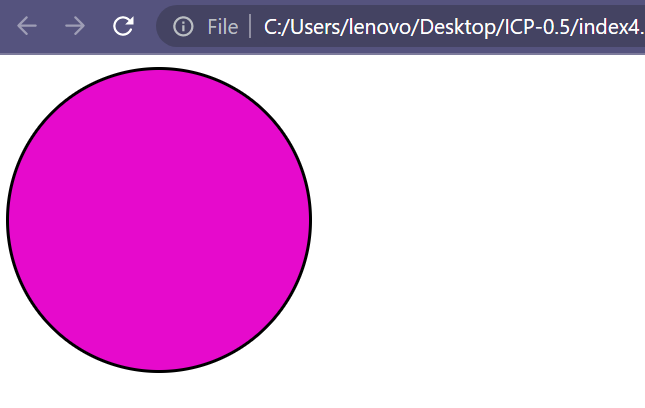
In this example, the element will have a circular shape because the border-radius is set to 50%.
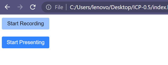
Here's an example:
<!DOCTYPE html>
<html>
  <head>
    <title>Border Radius</title>
    <style>
      #btn-recording {
        background-color: #99c2ff;
      }
      #btn-presenting {
        background-color: #3385ff;
        color: white;
      }
      .google-btn {
        height: 30px;
        width: 120px;
        border: none;
        border-radius: 3px;
      }
    </style>
  </head>
  <body>
    <button id="btn-recording" class="google-btn">Start Recording</button>
    <br /><br />
    <button id="btn-presenting" class="google-btn">Start Presenting</button>
  </body>
</html>
Output :