Configurable UI and Nomenclature
Configurable UI
A Configurable UI in React is a user interface that allows users to adjust and customize specific aspects of an application's behavior, appearance, or functionality without requiring changes to the underlying code. It provides a flexible and personalized user experience by enabling users the application to their preferences and needs through configurable settings and options.
Homepage Configuration Data:
{
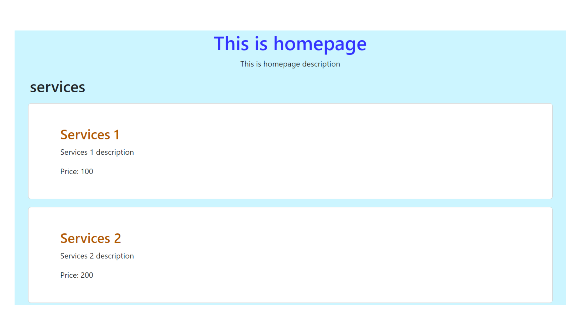
"title":"This is homepage",
"description": "This is homepage description",
"theme":{
"primaryColor":"#3333ff",
"secondaryColor":"#b35900",
"accentColor":"ccf5ff"
},
"services":[
{
"title":"Services 1",
"description": "Services 1 description",
"price": 100
},
{
"title":"Services 2",
"description": "Services 2 description",
"price": 200
},
{
"title":"Services 3",
"description": "Services 3 description",
"price": 300
}
]
}
React Component for Displaying Homepage with Configurable Data
import React from 'react';
import Config from './../../utils/config.json';

function Home(){
    return(
        <>
        <div className='container' style={{backgroundColor: Config.theme.accentColor}}>
        <h1 className='text-center' style={{color: Config.theme.primaryColor}}>{Config.title}</h1>
        <p className='text-center'>{Config.description}</p>

        <h2>services</h2>
        {
            Config.services.map((serviceData, index)=>{
                const {title, description, price} = serviceData
                return(
                    <div className='card m-3' key={index}>
                    <div className='card-body'>
                    <h3 className='card-title' style={{color: Config.theme.secondaryColor}}>{title}</h3>
                    <p className='card-text'>{description}</p>
                    <p className='card-text'>Price: {price}</p>
                    </div>
                    </div>
                )
            })
        }
        </div>
        </>
    )
}
export default Home;
Output :
Nomenclature
In React, nomenclature refers to the naming conventions and practices used for various elements within a React application. Clear and consistent naming is essential for code readability, maintainability, and collaboration among developers. Here are some common naming conventions and terms in React:
Component Names: React components are typically named using PascalCase, which means the first letter of each word is capitalized.
For example,MyComponentorUserProfile.Functional Components: Functional components, which are primarily used in modern React with hooks, are often named with descriptive nouns or phrases that reflect their purpose or content.
For example,Header,Button, orUserProfileCard.Props: Props (short for properties) are typically named using camelCase. Descriptive names are encouraged to make it clear what data or configuration is being passed to a component.
For example,username,imageUrl, orisDisabled.Event Handlers: Functions that handle events are typically named using a verb or action phrase followed by
"Handler"to make their purpose evident.
For example,handleClick,handleChange, orhandleSubmit.File and Folder Names: File and folder names should generally match the component name they contain.
For example, a component namedHeadershould be in a file calledHeader.js, and the folder containing it should also be namedHeader.
Adhering to established naming conventions and making meaningful naming choices helps ensure code consistency, maintainability, and collaboration in React projects. It allows developers to quickly understand the purpose and usage of different elements within the application.