Bootstrap & Font Awesome
Bootstrap
To use Bootstrap in a React application, you have several options. Bootstrap is a popular CSS framework that provides a set of pre-designed components and styles for building responsive web applications. Here's how you can integrate Bootstrap into your React project:
Method 1: Using Bootstrap CDN
This is the easiest and quickest way to get started with Bootstrap in your React application. You can include Bootstrap by adding its CSS and JavaScript files from a Content Delivery Network (CDN) in your HTML file (usually index.html in the public folder) and then use Bootstrap classes and components in your React components.
- Add Bootstrap CDN links to your
public/index.htmlfile:
<!DOCTYPE html>
<html>
  <head>
    <!-- ... other head elements ... -->
    <link
      href="https://cdn.jsdelivr.net/npm/[email protected]/dist/css/bootstrap.min.css"
      rel="stylesheet"
    />
  </head>
  <body>
    <!-- ... other body elements ... -->
    <script
      src="https://cdn.jsdelivr.net/npm/[email protected]/dist/js/bootstrap.min.js"
    ></script>
  </body>
</html>
- Now you can use Bootstrap classes and components in your React components as needed.
Method 2: Installing Bootstrap npm
You can also install Bootstrap as a dependency in your React project using npm. This method allows for more customization and integration with your build process.
Install Bootstrap and its dependencies:
npm install bootstrapImport Bootstrap
CSS&JSin your React application's entry point (usuallysrc/index.js):import 'bootstrap/dist/css/bootstrap.min.css';
import 'bootstrap/dist/js/bootstrap.bundle.min';You can now use Bootstrap classes and components in your React components as needed.
Example:
import React from 'react';

function MyComponent() {
  return (
    <div className="container">
      <button type="button" class="btn btn-primary p-3">Primary</button>
    </div>
  );
}

export default MyComponent;
output:

These are the most common methods for using Bootstrap in a React application. Choose the one that best fits your project's needs and your familiarity with the tools.
Font Awesome
The URL "https://fontawesome.com/icons" is "Font Awesome Icons." This is the official Font Awesome website where you can browse and access the collection of Font Awesome icons, learn how to use them, and access related resources.
To use Font Awesome icons in a React application, you can follow these steps:
Install the Font Awesome package:
You can install the Font Awesome package via npm:
npm install --save @fortawesome/fontawesome-svg-core
npm install --save @fortawesome/free-solid-svg-icons
npm install --save @fortawesome/react-fontawesome
Import Font Awesome Icons:
In your React component, import the necessary Font Awesome icons you want to use. For example, if you want to use the solid (fas) version of the heart icon, you can import it like this:
import { FontAwesomeIcon } from '@fortawesome/react-fontawesome';
import { faHeart } from '@fortawesome/free-solid-svg-icons';
You can import other icons in a similar manner.
Use the Font Awesome Icon Component:
Now that you've imported the icon, you can use the
FontAwesomeIconcomponent to render the icon in your JSX:import React from 'react';
import { FontAwesomeIcon } from '@fortawesome/react-fontawesome';
import { faHeart } from '@fortawesome/free-solid-svg-icons';
function App() {
return (
<div>
<p>This is a <FontAwesomeIcon icon={faHeart} /> icon.</p>
</div>
);
}
export default App;output:
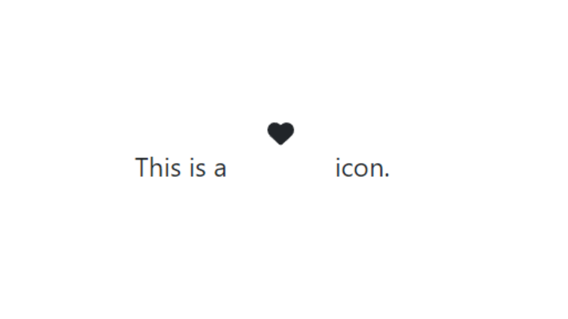
In this example, the heart icon is displayed using the <FontAwesomeIcon> component with the icon prop set to faHeart. You can customize the size, color, and other properties of the icon using the component's props.
Customize Icon Appearance:
You can customize the appearance of the icon by passing various props to the
<FontAwesomeIcon>component. For example:<FontAwesomeIcon icon={faHeart} size="2x" color="red" />This will render a red heart icon that is twice the default size.
Explore Other Icon Styles:
Font Awesome provides different styles of icons, including solid (
faSolid), regular (faRegular), light (faLight), etc. You can import icons from the appropriate packages and use them in the same way as shown above.For example, to use a regular style coffee icon:
import { FontAwesomeIcon } from '@fortawesome/react-fontawesome';
import { faCoffee } from '@fortawesome/free-regular-svg-icons';

// Inside your component
<FontAwesomeIcon icon={faCoffee} />
That's it! You should now be able to use Font Awesome icons in your React application.