psuedo elements
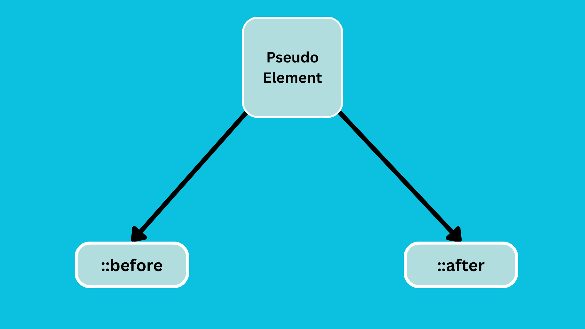
Pseudo-elements are used to add extra elements before or after the specific elements.
There are two pseudo elements.
::before: It is used to add content before the element.::after: It is used to add content after the element.
Example :
<!DOCTYPE html>
<html lang="en">
  <head>
    <meta charset="UTF-8" />
    <meta name="viewport" content="width=device-width, initial-scale=1.0" />
    <title>Pseudo Element in CSS</title>
    <style>
      .quote {
        color: #52527a;
        background-color: aliceblue;
        padding: 5px;
        border: 0.5px solid #47476b;
      }
    </style>
  </head>
  <body>
    <p class="quote">Knowledge is Power.</p>
    <p class="quote">Code is always does what you want.</p>
    <p class="quote">My Attitude is Depends on You.</p>
    <p class="quote">All is Well.</p>
  </body>
</html>
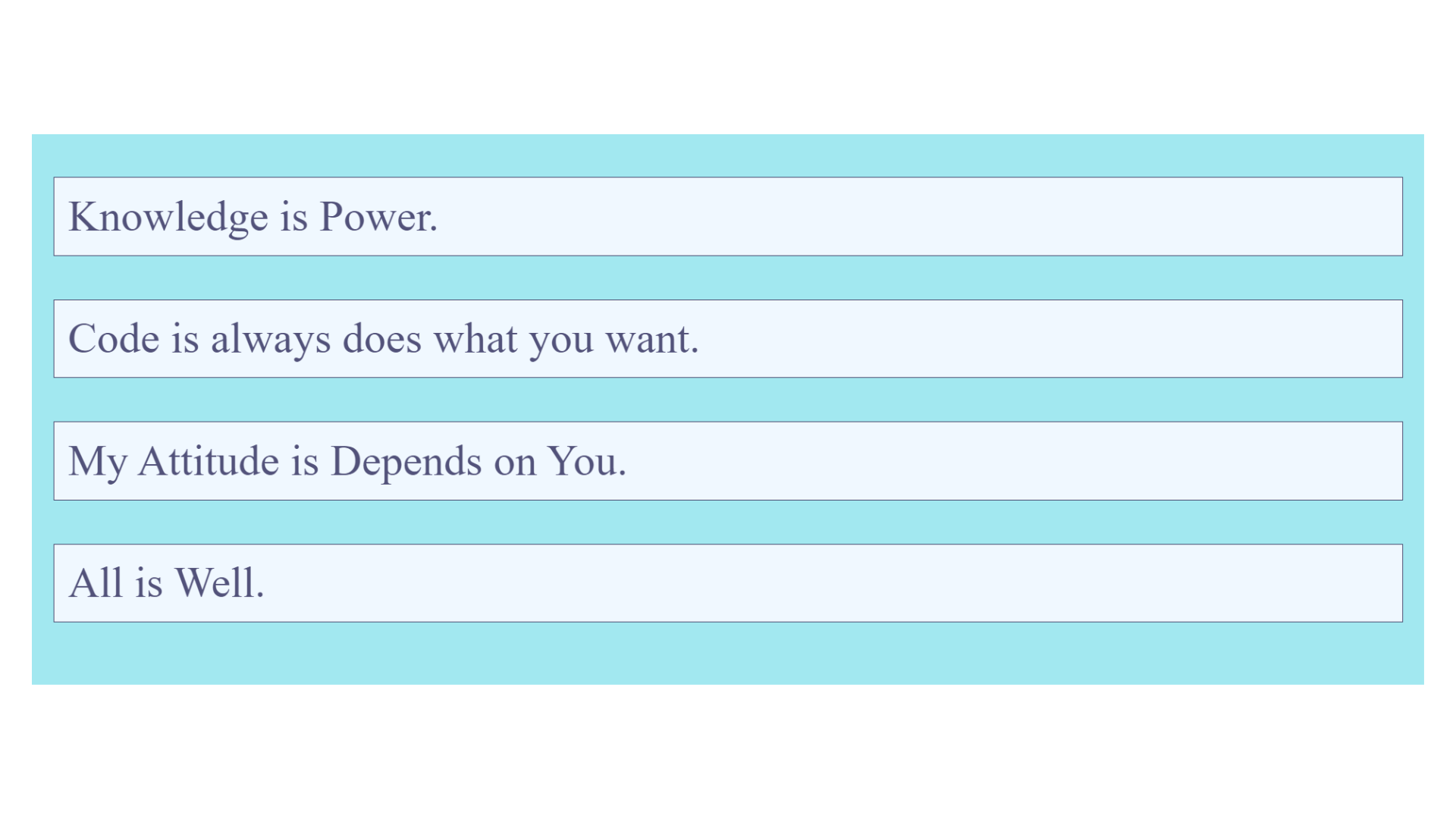
Output :
Example :
<!DOCTYPE html>
<html lang="en">
  <head>
    <meta charset="UTF-8" />
    <meta name="viewport" content="width=device-width, initial-scale=1.0" />
    <title>Pseudo Element in CSS</title>
    <style>
      body {
        background-color: rgb(162, 232, 240);
      }
      .quote {
        color: #52527a;
        background-color: aliceblue;
        padding: 5px;
        border: 0.5px solid #47476b;
      }
    </style>
  </head>
  <body>
    <p class="quote">=> Knowledge is Power.</p>
    <p class="quote">=> Code is always does what you want.</p>
    <p class="quote">=> My Attitude is Depends on You.</p>
    <p class="quote">=> All is Well.</p>
  </body>
</html>
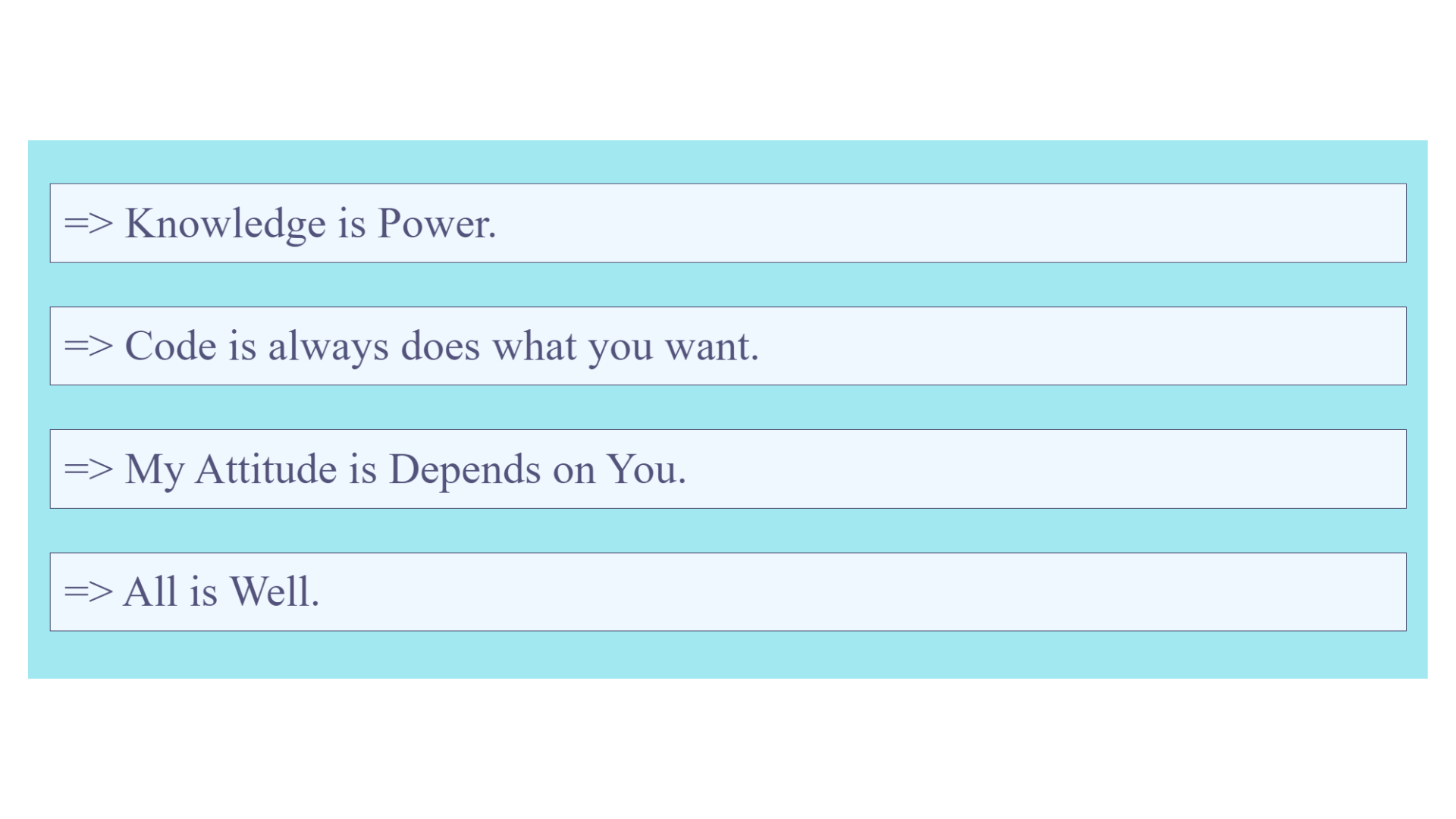
Output :
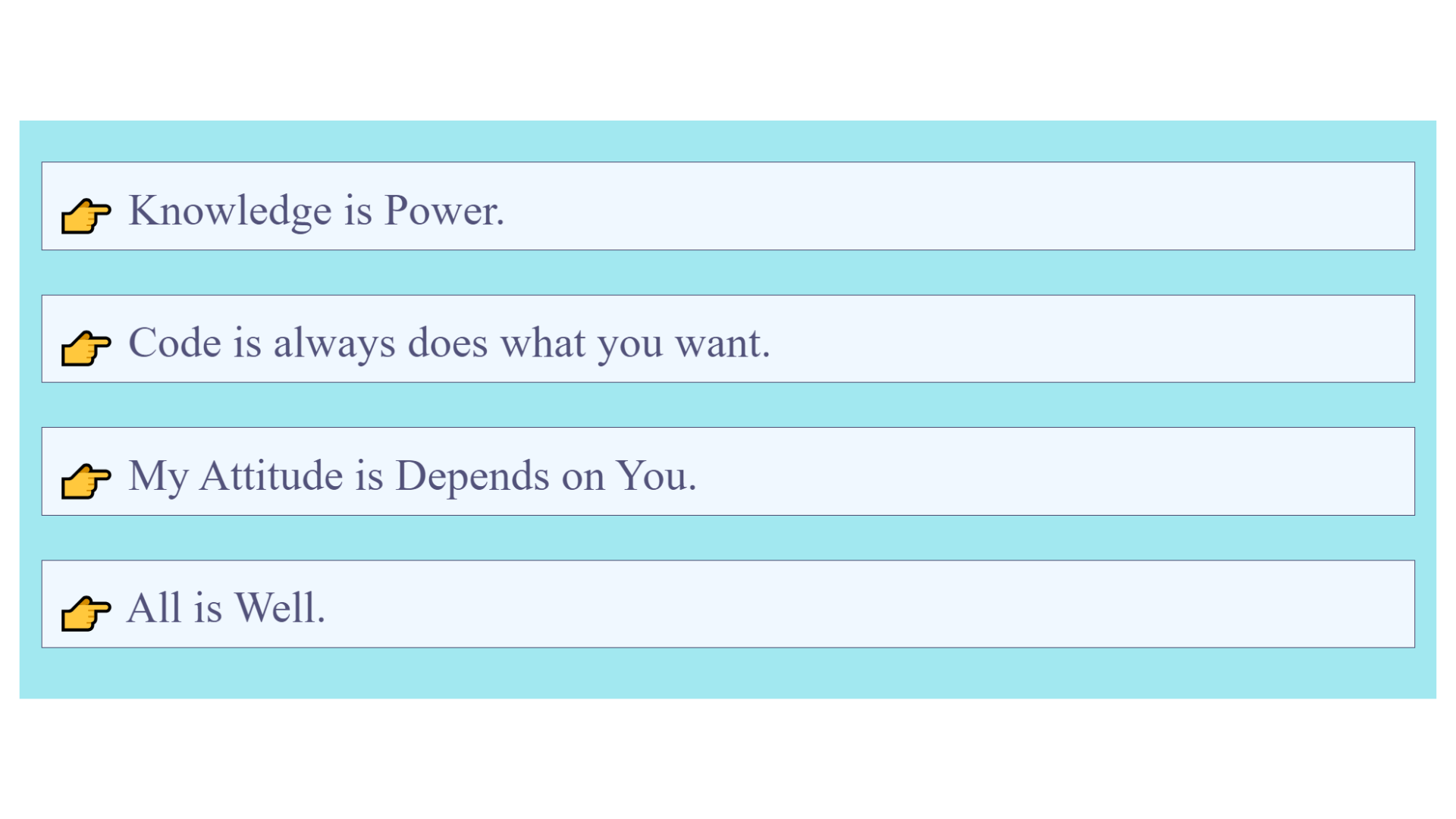
Example of the ::before :
<!DOCTYPE html>
<html lang="en">
  <head>
    <meta charset="UTF-8" />
    <meta name="viewport" content="width=device-width, initial-scale=1.0" />
    <title>Pseudo Element in CSS</title>
    <style>
      body {
        background-color: rgb(162, 232, 240);
      }
      .quote {
        color: #52527a;
        background-color: aliceblue;
        padding: 5px;
        border: 0.5px solid #47476b;
      }

      .quote::before {
        content: "👉";
      }
    </style>
  </head>
  <body>
    <p class="quote">Knowledge is Power.</p>
    <p class="quote">Code is always does what you want.</p>
    <p class="quote">My Attitude is Depends on You.</p>
    <p class="quote">All is Well.</p>
  </body>
</html>
Output :
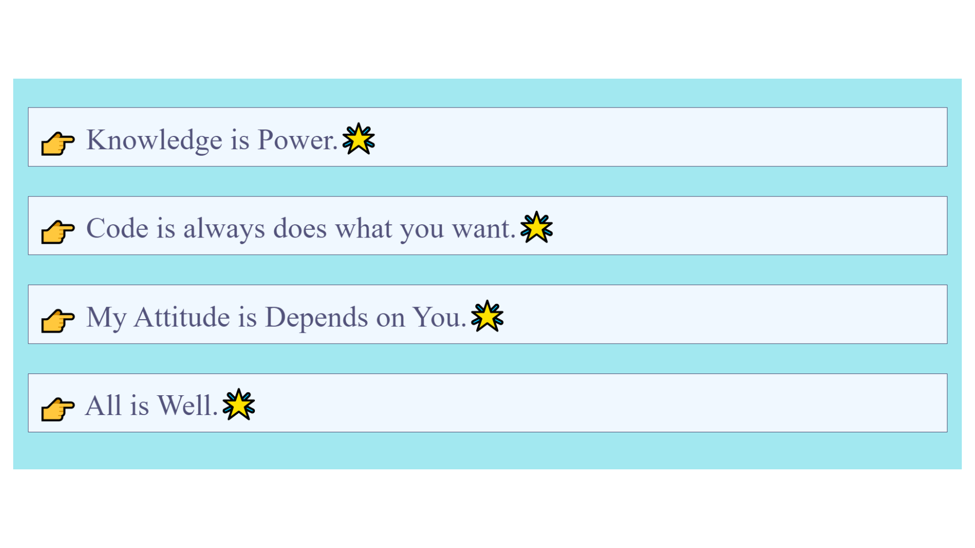
Example of ::before and ::after:
<!DOCTYPE html>
<html lang="en">
  <head>
    <meta charset="UTF-8" />
    <meta name="viewport" content="width=device-width, initial-scale=1.0" />
    <title>Pseudo Element in CSS</title>
    <style>
      body {
        background-color: rgb(162, 232, 240);
      }
      .quote {
        color: #52527a;
        background-color: aliceblue;
        padding: 5px;
        border: 0.5px solid #47476b;
      }

      .quote::before {
        content: "👉";
      }

      .quote::after {
        content: "🌟";
      }
    </style>
  </head>
  <body>
    <p class="quote">Knowledge is Power.</p>
    <p class="quote">Code is always does what you want.</p>
    <p class="quote">My Attitude is Depends on You.</p>
    <p class="quote">All is Well.</p>
  </body>
</html>
Output :
Example :
<!DOCTYPE html>
<html lang="en">
  <head>
    <meta charset="UTF-8" />
    <meta name="viewport" content="width=device-width, initial-scale=1.0" />
    <title>Pseudo Element in CSS</title>
    <style>
      body {
        background-color: rgb(162, 232, 240);
      }
      .quote {
        color: #52527a;
        background-color: aliceblue;
        padding: 5px;
        border: 0.5px solid #47476b;
      }

      .quote::after {
        content: attr(author);
      }
    </style>
  </head>
  <body>
    <p class="quote" author=" Pinki 💙">Knowledge is Power.</p>
    <p class="quote" author=" Yogita 💛">Code is always does what you want.</p>
    <p class="quote" author=" Vaishnavi 💚">My Attitude is Depends on You.</p>
    <p class="quote" author=" Anand 💜">All is Well.</p>
  </body>
</html>
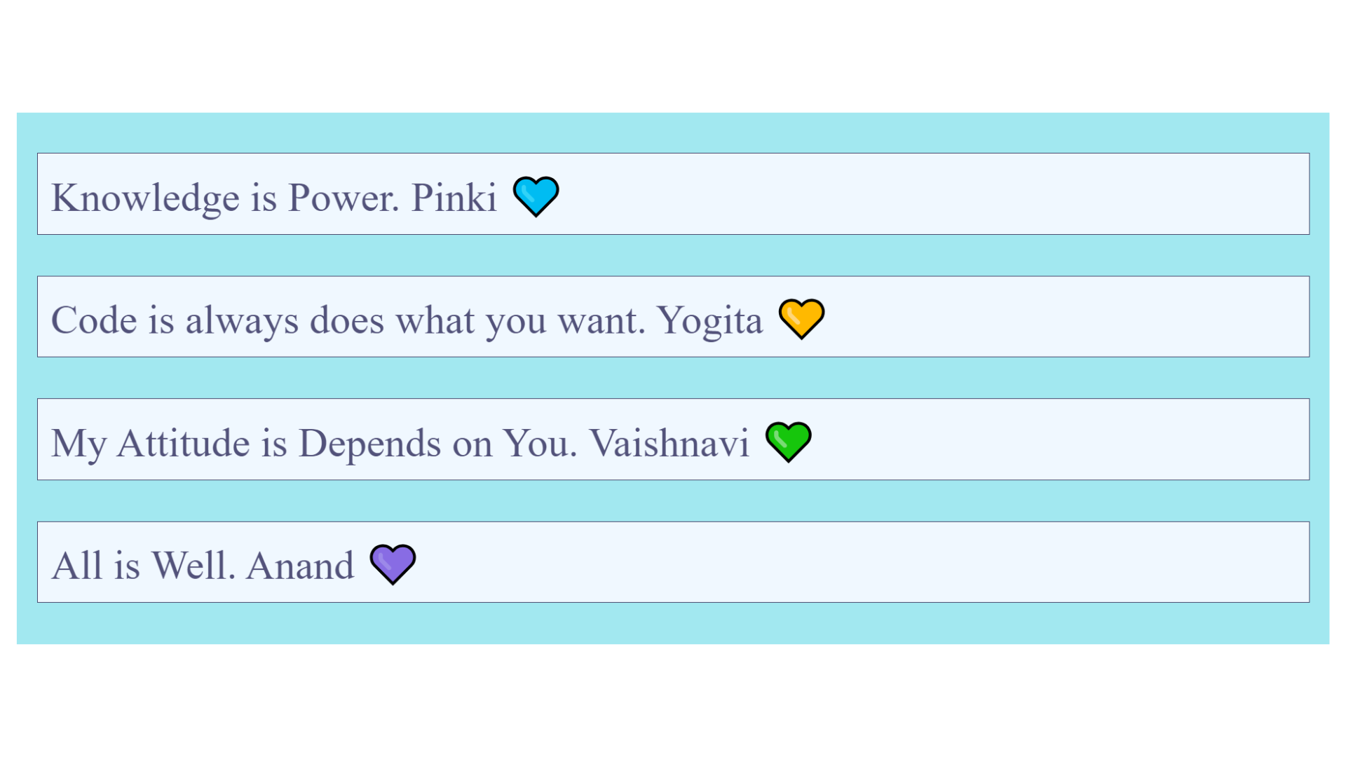
Output :
Example Explanation :
In the example above, we included a custom author attribute within the <p> tag, which has the class name quote. This attribute is used in the CSS code to display the names of the authors using the ::after pseudo-element.
The CSS style used adds text after any elements with the class quote. It retrieves the names from the author attribute within the HTML and displays them as the added text.
How to add tooltip?
<!DOCTYPE html>
<html lang="en">
  <head>
    <meta charset="UTF-8" />
    <meta name="viewport" content="width=device-width, initial-scale=1.0" />
    <title>Hover Button</title>
    <style>
      .my-btn {
        background-color: tomato;
        padding: 10px;
        border: none;
        border-radius: 5px;
        cursor: pointer;
        position: relative;
        font-size: 20px;
        color: white;
      }

      .my-btn:hover::after {
        content: attr(tooltip-message);
        position: absolute;
        left: 70px;
        top: 5px;
        width: 80px;
        padding: 10px;
        font-size: 15px;
        color: white;
        background-color: black;
        border-radius: 5px;
      }
    </style>
  </head>

  <body>
    <button class="my-btn" tooltip-message="Click Here to Edit">Edit</button>
    <br /><br />
    <button class="my-btn" tooltip-message="Click Here to Save">Save</button>
  </body>
</html>
Output :
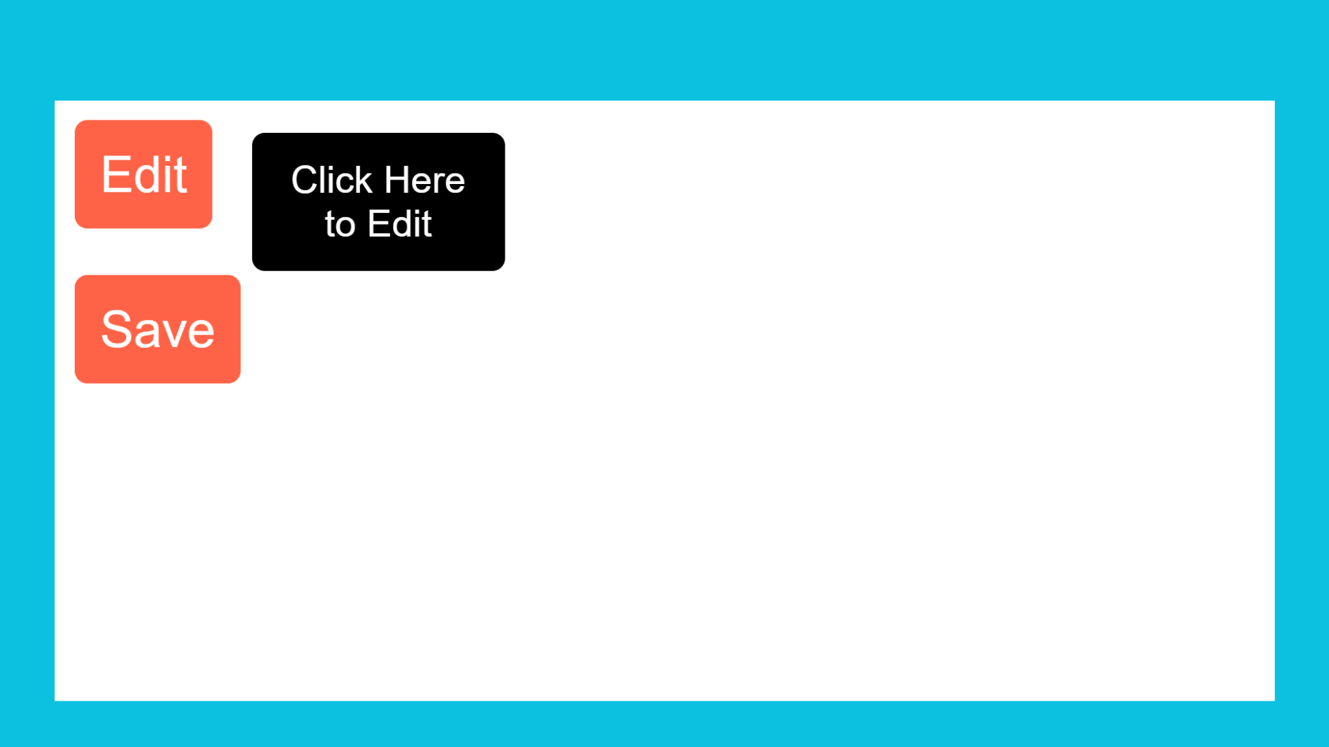
After hover on First button.
After hover on Second button.
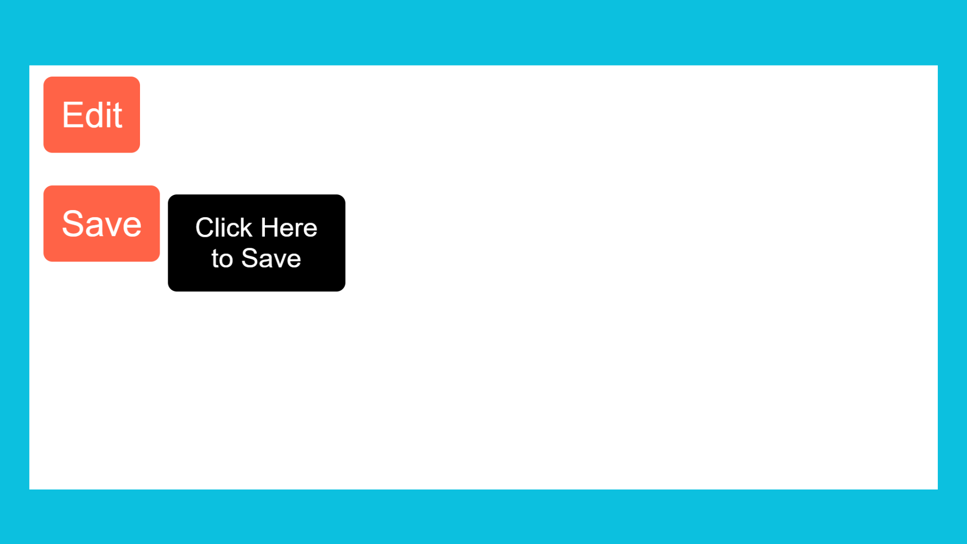
Example Explanation :
In the above example, we used the tooltip-message attribute to display different messages when hovering over different elements. We can then use the attr() function in CSS to pass the attribute as the content.