Media Queries
Media Queries allow you to create responsive websites on all screen sizes from desktop to mobile.
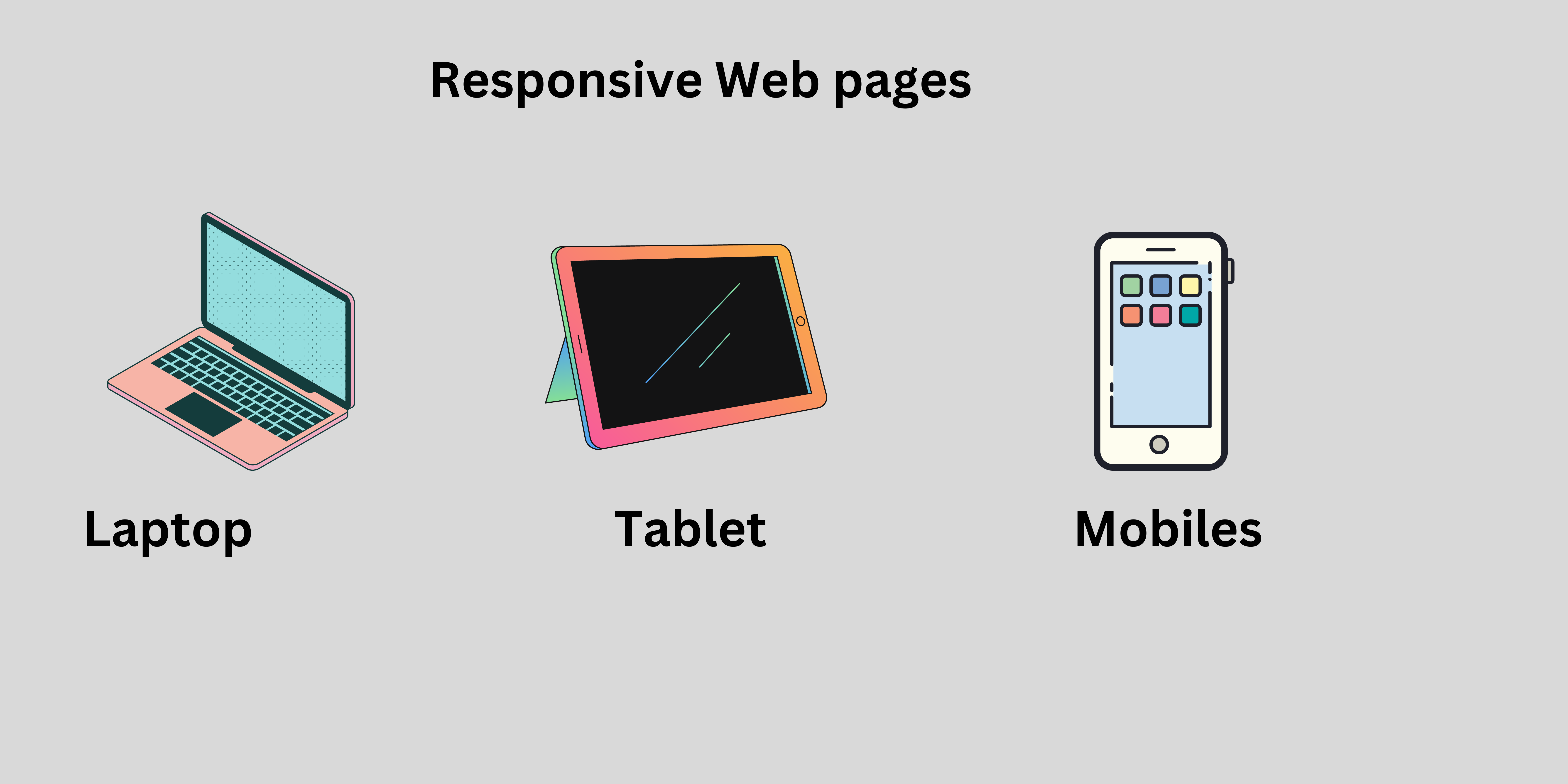
In a big screen you can show all possible elements.
In a small screen you can show only important elements.
For example :
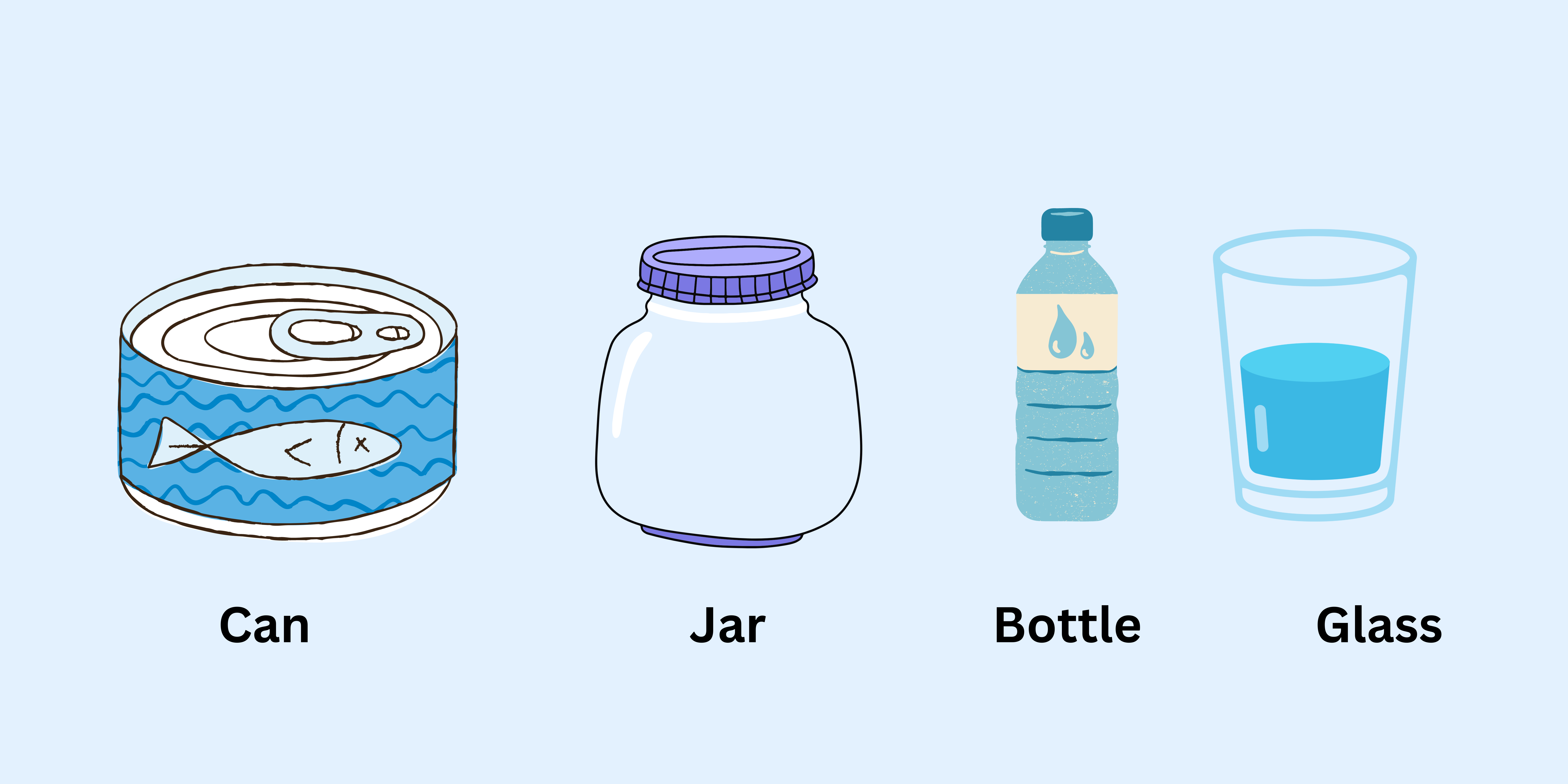
In the above example, we can store the water in different containers like can, jar, bottle and glass. The water takes the shape of a container like we can store the water in jar the water takes a shape of jar. Also we can store the water in a bottle, jar and glass the water takes the shape of a bottle, glass and jar. Same as our webpage. The webpage can be opened on different devices the webpage takes the shape of a device. Suppose a webpage is in a laptop then it takes the shape of a laptop that contains images and icons in the webpages.
Device Breakpoint
- Small mobile device : less than
600px - Normal mobile device : greater than
600pxand less than768px - Tablets : greater than
768pxand less than992px - Laptops / desktops : greater than
992pxand less than1200px - TV/Large desktop : greater than
1200px
Rules for creating website responsive:
Keeps the elements or cards horizontally on big screens. Arrange elements vertically on small screens.
Keep dimensions of text, images and buttons large on larger screens or small on smaller screens.
Use icons on smaller devices insted of text if possible.
- Media Query calculate
screen sizeand if it matches you passed screen size and media query screen size then media query will apply effect.
max-width
The max-width are specifies the maximum width of a particular device.
Syntax :
@media screen and (max-width: 600px) {
}
For example :
<!DOCTYPE html>
<html>
  <head>
    <title>Media Query</title>
    <style>
      .btn {
        width: 350px;
        height: 60px;
        font-size: 30px;
        border-radius: 5px;
        background-color: tomato;
        color: white;
      }

      @media screen and (max-width: 500px) {
        .btn {
          background-color: blue;
          width: 150px;
          height: 40px;
          font-size: 15px;
        }
      }
    </style>
  </head>

  <body>
    <button class="btn">This Is Button</button>
  </body>
</html>
Output :
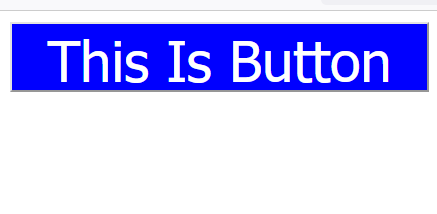
Normal Screen

Screen size is less than 500px
Example explanation :
In the above example, in the normal screen 1st output will display and if the screen size is less than 500px then the media query effects will apply then that's the time 2nd output will display on the screen.
min-width
The min-width are specifies the minimum width of a particular device.
Syntax :
@media screen and (min-width: 600px) {
}
For example :
<!DOCTYPE html>
<html>
  <head>
    <title>Media Query</title>
    <style>
      .btn {
        width: 350px;
        height: 60px;
        font-size: 30px;
        border-radius: 5px;
        background-color: tomato;
        color: white;
      }

      @media screen and (min-width: 600px) {
        .btn {
          background-color: blue;
          width: 150px;
          height: 40px;
          font-size: 15px;
        }
      }
    </style>
  </head>

  <body>
    <button class="btn">This Is Button</button>
  </body>
</html>
Output :
Normal Screen

Screen size is less than 600px

Example explanation :
In the above example, in the normal screen 1st output will display and if the screen size is less than 600px then the media query effects will apply then that's the time 2nd output will display on the screen.
min-width and max-width at same time
Syntax :
@media screen and (min-width: 600px) and (max-width: 800px) {
}
For example :
<!DOCTYPE html>
<html>
  <head>
    <title>Media Query</title>
    <style>
      .btn {
        width: 350px;
        height: 60px;
        font-size: 30px;
        border-radius: 5px;
        background-color: tomato;
        color: white;
      }

      /* Mobile Devices */

      @media screen and (min-width: 600px) and (max-width: 768px) {
        .btn {
          background-color: aquamarine;
        }
      }

      /* Tablet Devices */

      @media screen and (min-width: 769px) and (max-width: 992px) {
        .btn {
          background-color: blue;
        }
      }

      /* Dekstop device */

      @media screen and (min-width: 993px) and (max-width: 1200px) {
        .btn {
          background-color: chartreuse;
        }
      }
    </style>
  </head>

  <body>
    <button class="btn">This is button</button>
  </body>
</html>
Output :

Screen size is less than 600px
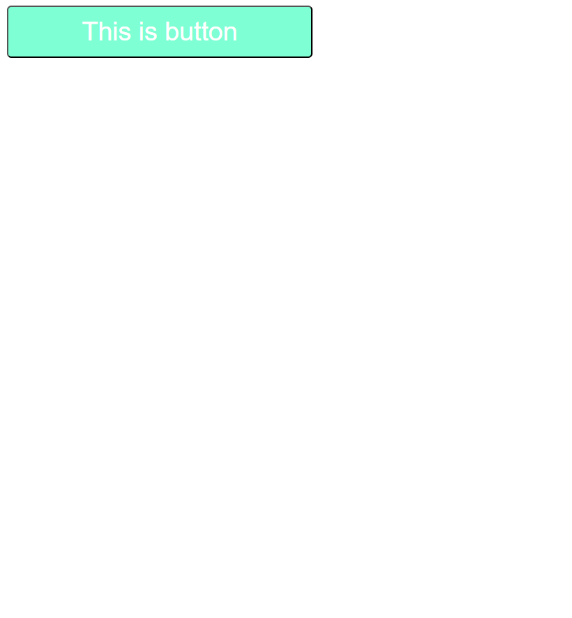
Screen size is less than 769px
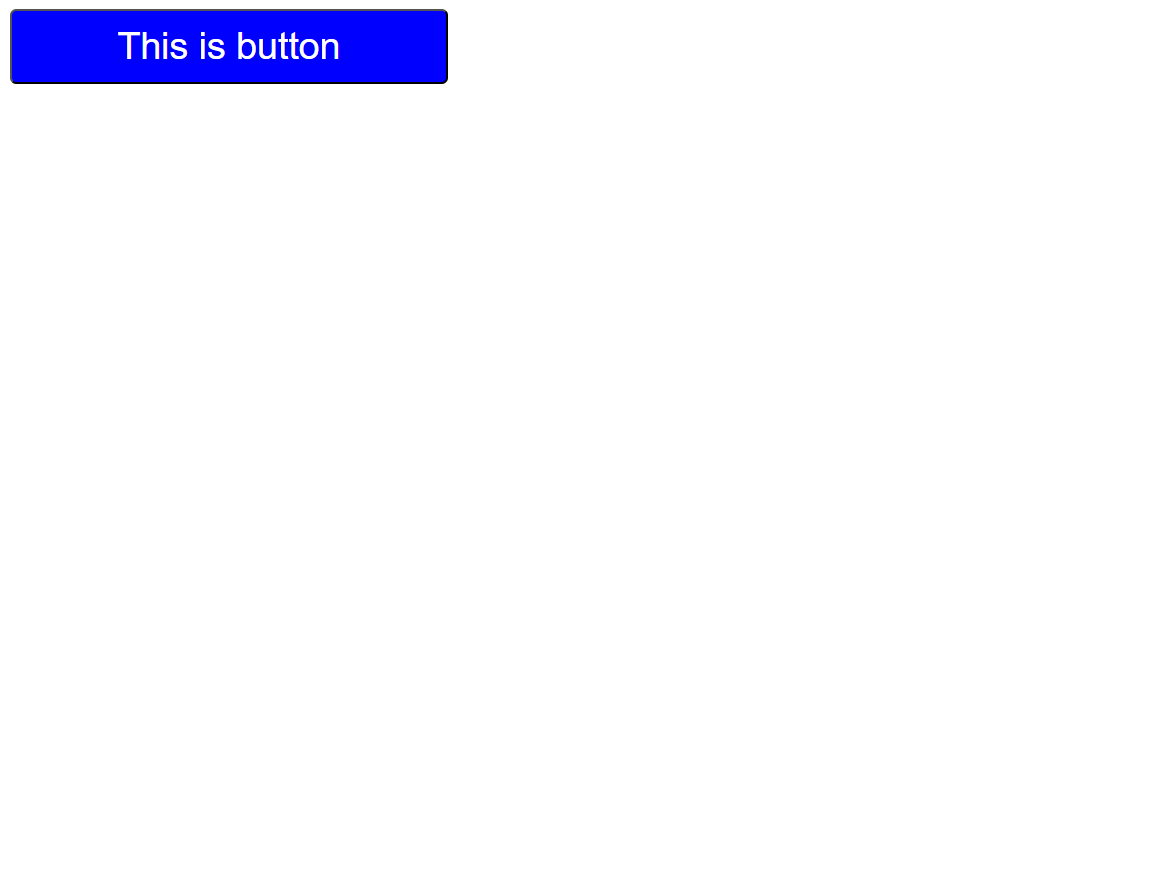
Screen size is less than 993px

Example explanation :
In the above example, in the normal screen 1st output will display and if the screen size is less than 600px then the media query effects will apply then that's the time 2nd output will display on the screen.
Responsive Design:
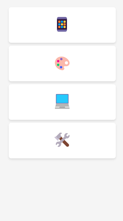
At smaller screen sizes (max-width: 480px), only the emoji is visible. Other details heading, info and basic are hidden.
For example :
<!DOCTYPE html>
<html lang="en">

<head>
    <meta charset="UTF-8">
    <meta name="viewport" content="width=device-width, initial-scale=1.0">
    <title>Document</title>
    <style>
        body {
            background-color: whitesmoke;
            padding: 10px;
        }

        .container {
            display: flex;
            flex-wrap: wrap;
            justify-content: space-evenly;
            margin: 5px;
        }

        .card {
            background: white;
            border-radius: 8px;
            box-shadow: 0 4px 6px rgba(0, 0, 0, 0.1);
            width: 250px;
            margin: 5px;
            padding: 20px;
            text-align: center;
        }

        .emoji {
            font-size: 60px;
            margin-bottom: 10px;
        }

        .heading {
            font-size: 20px;
            color: black;
            margin: 10px 0;
        }

        .info {
            font-size: 15px;
            color: gray;
        }


        @media (max-width: 480px) {
            .card {
                width: 100%;
            }

            .heading,
            .info {
                display: none;
            }

            .emoji {
                font-size: 3rem;
            }
        }
    </style>
</head>

<body>
    <div class="container">
        <div class="card">
            <div class="emoji">📱</div>
            <h3 class="heading">Image Formats</h3>
            <p class="info">Choose the right format for quality and size.</p>
        </div>
        <div class="card">
            <div class="emoji">🎨</div>
            <h3 class="heading">Image Editing</h3>
            <p class="info">Enhance images with easy-to-use tools.</p>
        </div>
        <div class="card">
            <div class="emoji">💻</div>
            <h3 class="heading">Syntax</h3>
            <p class="info">Ensure images look good on all devices.</p>
        </div>
        <div class="card">
            <div class="emoji">🛠️</div>
            <h3 class="heading">Tools</h3>
            <p class="info">Reduce file size without losing quality.</p>
        </div>
    </div>

</body>

</html>
Output :
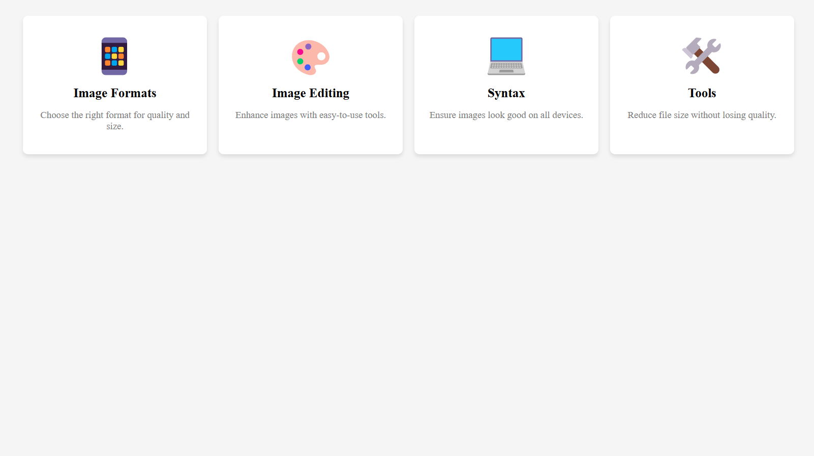
Screen size is less than 480px
Colors in CSS
There are different ways to add css colors.
1. Color name
CSS provides predefined color names that you can use directly.
Example :
<!DOCTYPE html>
<html lang="en">
  <head>
    <title>css-color</title>
    <style>
      .btn {
        background-color: red;
        color: white;
      }
    </style>
  </head>
  <body>
    <button class="btn">Click Here</button>
  </body>
</html>
Output :

Example explanation :
In the above example, set the background color to "red" or the text color to "white".
2.Hexadecimal colors:
Hexadecimal colors start with a pound sign (#) followed by six characters representing red, green, and blue (RGB) values. Each pair of characters represents a value from 00 (minimum) to FF (maximum).
Example :
<!DOCTYPE html>
<html lang="en">
  <head>
    <title>css-color</title>
    <style>
      .btn {
        background-color: #ff0000;
        color: #ffffff;
      }
    </style>
  </head>

  <body>
    <button class="btn">Click Here</button>
  </body>
</html>
Output :
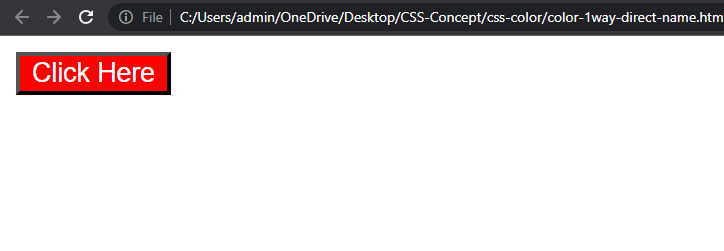
Example explanation :
In the above example, sets the background color to red (#FF0000) and the text color to white (#FFFFFF).
3.rgb
RGB colors allow you to specify the intensity of red, green, and blue using decimal values ranging from 0 to 255. You can use the rgb() function for this.
Example :
<!DOCTYPE html>
<html lang="en">
  <head>
    <title>css-color</title>
    <style>
      .btn {
        background-color: rgb(255, 0, 0);
        color: rgb(255, 255, 255);
      }
    </style>
  </head>

  <body>
    <button class="btn">Click Here</button>
  </body>
</html>
Output :

Example explanation :
In the above example, sets the background color to red (255, 0, 0) and the text color to white (255, 255, 255).
4.rgba
RGBA colors are similar to RGB, but with an additional alpha channel representing capacity. The alpha value ranges from 0 (transparent) to 1 (opaque). Use the rgba() function to specify these colors.
Example :
<!DOCTYPE html>
<html lang="en">
  <head>
    <title>css-color</title>
    <style>
      .btn {
        background-color: rgba(0, 0, 0, 0);
      }
    </style>
  </head>

  <body>
    <button class="btn">Click Here</button>
  </body>
</html>
Output :
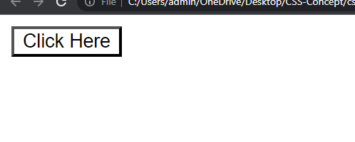
Example explanation :
In the above example, the background color is black with full transparency (0), making it completely invisible.
5. hsl
HSL colors define hue, saturation, and lightness. Hue represents a color on the color wheel, saturation determines the intensity and lightness controls the brightness. Use the hsl() function to specify these colors.
Example :
<!DOCTYPE html>
<html lang="en">
  <head>
    <title>css-color</title>
    <style>
      .btn {
        background-color: hsl(0, 100%, 50%);
      }
    </style>
  </head>

  <body>
    <button class="btn">Click Here</button>
  </body>
</html>
Output :
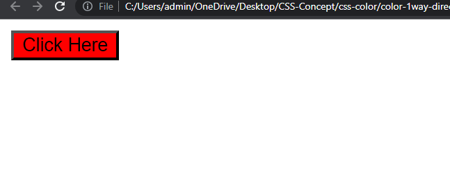
Example explanation :
In the above example, sets the background color to pure red (0 degrees), with 100% saturation and 50% lightness.
You can refer to the following websites to choose colors:
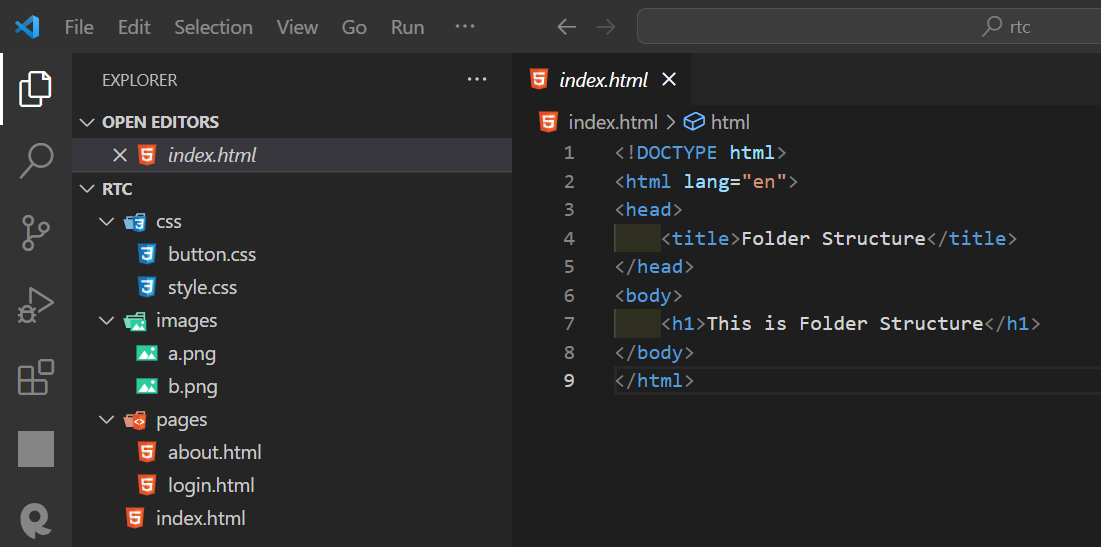
Folder Structure
The folder structure in HTML is how you arrange the files and folders in your project.
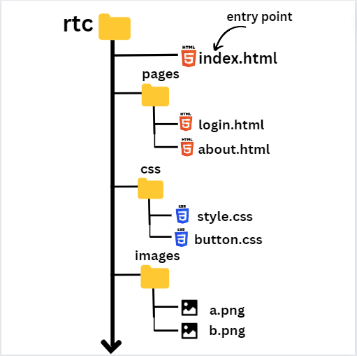
Folder Structure in VS-code
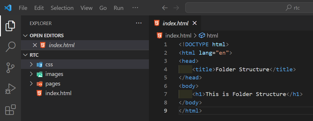
After Exapanding folders
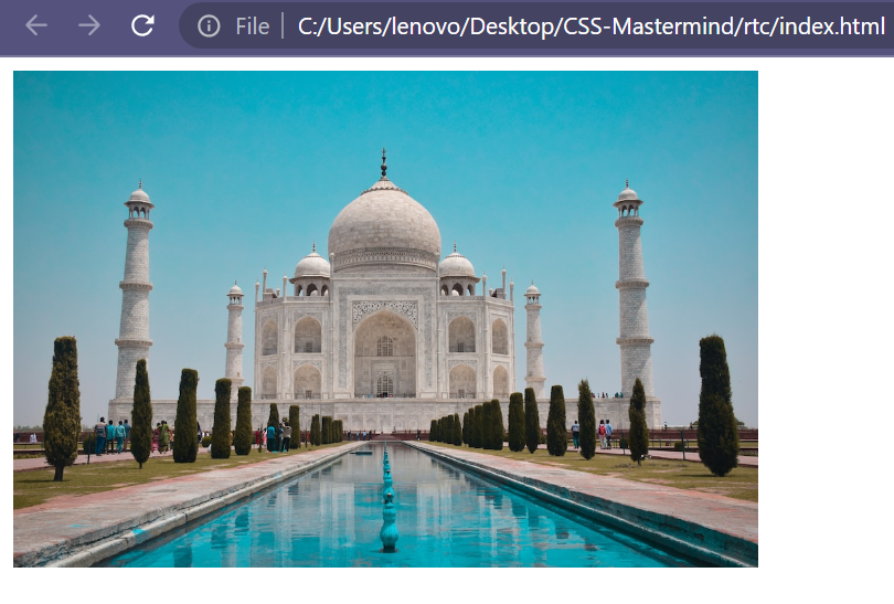
How to pass the path for an image in HTML?
Code :
<!DOCTYPE html>
<html lang="en">
  <head>
    <title>Folder Structure</title>
    <style>
      .img {
        height: 300px;
      }
    </style>
  </head>
  <body>
    <img src="./images/taj.jpg" class="img" />
  </body>
</html>
./ indicates that the current folder.
Output :
Simple Login form by using folder structure and external css file
Code :
File Name : login.html
<!DOCTYPE html>
<html lang="en">
  <head>
    <meta charset="UTF-8" />
    <meta name="viewport" content="width=device-width, initial-scale=1.0" />
    <title>Login Form</title>
    <link rel="stylesheet" href="./../css/style.css" />
  </head>

  <body>
    <div class="login-container">
      <img
        src="./../images/image-header/profile.png"
        alt="profile"
        class="profile-img d-block"
      />

      <input
        type="email"
        placeholder="Enter Your Email"
        class="input-box d-block"
      />

      <input
        type="password"
        placeholder="Enter Password"
        class="input-password d-block"
      />

      <button class="btn-login d-block">Login Now</button>
    </div>
  </body>
</html>
File Name : style.css
body {
  background-color: black;
}

.login-container {
  background-color: white;
  height: 500px;
  width: 400px;
  margin: 0 auto;
  border-radius: 20px;
  box-shadow: 0px 0px 4px 4px steelblue;
  margin-top: 30px;
}

.profile-img {
  padding-top: 30px;
}

.input-box {
  height: 40px;
  width: 300px;
  margin-top: 20px;
  padding: 5px;
}

.btn-login {
  margin-top: 30px;
  width: 200px;
  font-size: 25px;
  padding: 7px;
  background-color: rgb(67, 67, 247);
  border: none;
  border-radius: 10px;
}

.d-block {
  display: block;
  margin-left: auto;
  margin-right: auto;
}
Output :
