Box Shadow and Hover
Hover
The :hover selector is used to apply styles to an element when it is being hovered over by the mouse. It allows you to add interactive effects to elements on your web page.
In the first example you provided, the HTML code is as follows:
Code :
<!DOCTYPE html>
<html lang="en">
  <head>
    <title>Hover</title>
    <style>
      .btn {
        background-color: tomato;
        color: white;
        border: 2px solid dashed;
        border-radius: 10px;
      }
      .btn:hover {
        background-color: aquamarine;
        color: black;
      }
    </style>
  </head>
  <body>
    <button class="btn">Awesome button</button>
  </body>
</html>
In this example, there is a button element with the class btn. The CSS styles defined for the class btn specify that the background color is tomato, the text color is white, and there is a dashed border with a 2px width and a border-radius of 10px.
The .btn:hover selector is used to define the styles that will be applied when the button is being hovered over. In this case, it changes the background color to aquamarine and the text color to black.
When you view this HTML page in a browser, the button will have the default styles defined by the .btn class. However, when you move your mouse over the button, the styles defined by the .btn:hover selector will be applied, resulting in a different background color and text color for the button.
Hover effect on image
In the second example you provided, you want to apply a hover effect to an image. Here's the code:
Example :
<!DOCTYPE html>
<html lang="en">
  <head>
    <title>shadow</title>
    <style>
      img-tiger {
        height: 100px;
        border-radius: 50%;
      }
      img-tiger:hover {
        border-radius: 20px;
        transition: 2s;
        margin-left: 30px;
      }
    </style>
  </head>
  <body>
    <img src="tiger.png" alt="img" />
  </body>
</html>
Output :
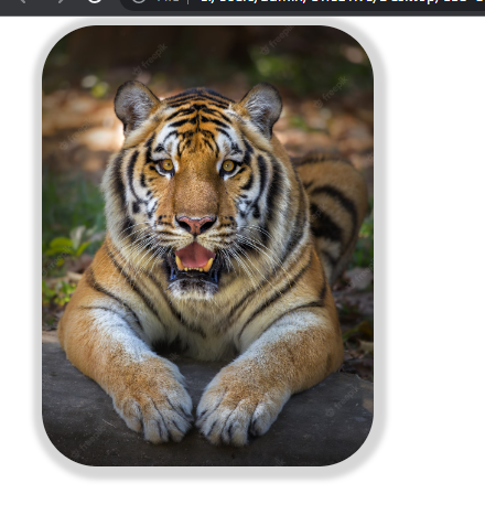
In this example, there is an image element with the class img-tiger. The CSS styles defined for the class img-tiger specify that the image should have a height of 100px and a border-radius of 50%, giving it a circular shape.
The .img-tiger:hover selector is used to define the styles that will be applied when the image is being hovered over. In this case, it changes the border-radius to 20px, making the image slightly less circular. It also adds a transition effect with a duration of 2 seconds, so the change happens gradually. Additionally, it moves the image 30px to the right by setting the margin-left property.
When you view this HTML page in a browser, the image will have the default styles defined by the .img-tiger class. However, when you move your mouse over the image, the styles defined by the .img-tiger:hover selector will be applied, resulting in a change in border-radius and a transition effect.
Box-Shadow
The box-shadow property is used to add one or more shadows to an element. It allows you to create visually appealing effects, such as giving the illusion of depth or highlighting elements.
The syntax for the box-shadow property is as follows:
       h-shadow v-shadow  blur spread  color
          |       |      |      |       |
box-shadow: 5px 5px 5px 2px #808080;
h-shadow: The horizontal offset of the shadow. A positive value puts the shadow on the right side of the box, and a negative value puts the shadow on the left side.v-shadow: The vertical offset of the shadow. A positive value puts the shadow below the box, and a negative value puts the shadow above.blur: The blur radius. The higher the value, the more blurred the shadow will be.spread: The spread radius. A positive value increases the size of the shadow, and a negative value decreases the size.color: The color of the shadow.
In the third example you provided, you want to add a box shadow to an image. Here's the code:
Code :
<!DOCTYPE html>
<html lang="en">
  <head>
    <title>shadow</title>
    <style>
      .img-tiger {
        height: 300px;
        border-radius: 50px;
        margin: 30px;
        box-shadow: 2px 2px 5px 10px rgb(138, 136, 136);
      }

      .img-tiger:hover {
        border-radius: 20px;
        transition: 2s;
      }
    </style>
  </head>

  <body>
    <img src="tiger.png" class="img-tiger" alt="img" />
  </body>
</html>
Output :
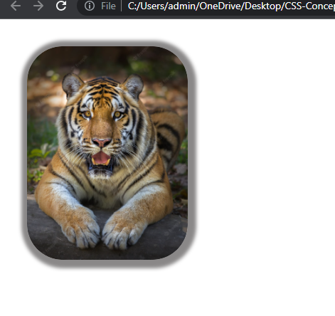
In this example, there is an image element with the class img-tiger. The CSS styles defined for the class img-tiger specify that the image should have a height of 300px, a border-radius of 50px, and a margin of 30px. The box-shadow property is used to add a shadow to the image. The values 2px 2px 5px 10px define the horizontal offset, vertical offset, blur radius, and spread radius of the shadow, respectively. The color of the shadow is specified as rgb(138, 136, 136).
When you view this HTML page in a browser, the image will have a box shadow applied to it according to the styles defined by the .img-tiger class. When you move your mouse over the image, the border-radius will change to 20px with a transition effect, as defined by the .img-tiger:hover selector.
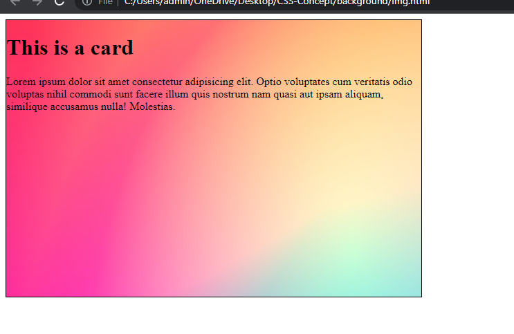
Background image
The background-image property in CSS is used to set one or more background images for an element.
Syntax :
background-image: url("image-url");
Example :
<!DOCTYPE html>
<html lang="en">
  <head>
    <title>background-image</title>
    <style>
      .container {
        border: 1px solid black;
        width: 600px;
        height: 400px;
        background-image: url("https://images.unsplash.com/photo-1579546929518-9e396f3cc809?ixlib=rb-4.0.3&ixid=M3wxMjA3fDB8MHxleHBsb3JlLWZlZWR8MXx8fGVufDB8fHx8fA%3D%3D&w=1000&q=80");
      }
    </style>
  </head>

  <body>
    <div class="container">
      <h1>This is a card</h1>
      <p>
        Lorem ipsum dolor sit amet consectetur adipisicing elit. Optio
        voluptates cum veritatis odio voluptas nihil commodi sunt facere illum
        quis nostrum nam quasi aut ipsam aliquam, similique accusamus nulla!
        Molestias.
      </p>
    </div>
  </body>
</html>
Output :
Example explanation :
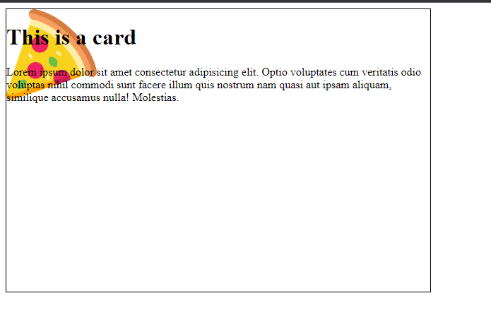
In the above example, the .container class is used to define a container element with a background image. The background-image property is set to the URL of the desired image. In this case, we're using an image from Unsplash. The image will be displayed as the background of the container element
Background-size
The background-size property in CSS is used to control the size of the background image.
backgound-size: auto
This value is used to set the background image to its original size.
Example :
<!DOCTYPE html>
<html lang="en">
  <head>
    <meta charset="UTF-8" />
    <meta name="viewport" content="width=device-width, initial-scale=1.0" />
    <title>background-image</title>
    <style>
      .container {
        border: 1px solid black;
        width: 600px;
        height: 400px;
        background-image: url("https://cdn-icons-png.flaticon.com/128/3595/3595455.png");
        background-size: auto;
      }
    </style>
  </head>

  <body>
    <div class="container">
      <h1>This is a card</h1>
      <p>
        Lorem ipsum dolor sit amet consectetur adipisicing elit. Optio
        voluptates cum veritatis odio voluptas nihil commodi sunt facere illum
        quis nostrum nam quasi aut ipsam aliquam, similique accusamus nulla!
        Molestias.
      </p>
    </div>
  </body>
</html>
Output :
Example explanation:
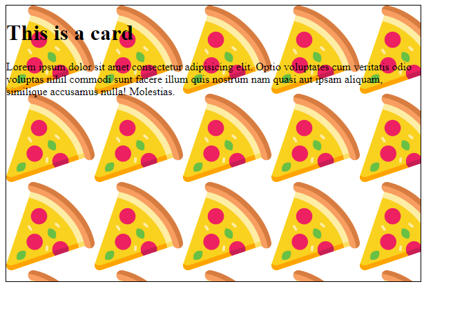
In the above example, we set background image by using background-img property. Also we can set background-size that sets the original size of the image and image is small that's why it display image repetedly.
background-size: cover
This value is used to scale the background image to cover the entire container, while maintaining the image's aspect ratio. The image may be cropped or stretched as needed.
Example :
<!DOCTYPE html>
<html lang="en">
  <head>
    <meta charset="UTF-8" />
    <meta name="viewport" content="width=device-width, initial-scale=1.0" />
    <title>background-image</title>
    <style>
      .container {
        border: 1px solid black;
        width: 600px;
        height: 400px;
        background-image: url("https://cdn-icons-png.flaticon.com/128/3595/3595455.png");
        background-size: cover;
      }
    </style>
  </head>

  <body>
    <div class="container">
      <h1>This is a card</h1>
      <p>
        Lorem ipsum dolor sit amet consectetur adipisicing elit. Optio
        voluptates cum veritatis odio voluptas nihil commodi sunt facere illum
        quis nostrum nam quasi aut ipsam aliquam, similique accusamus nulla!
        Molestias.
      </p>
    </div>
  </body>
</html>
Output :
Example explanation :
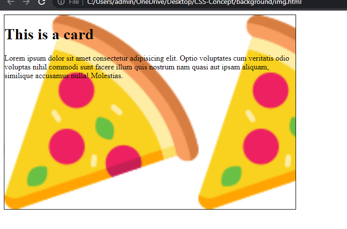
In the above example, .container class is used to define a container element with a background image. The background-image property is set to the URL of the desired image. In this case, we used background-size:cover. This property is cover the entire container and image is stretched.
We can set background size in height and width:
Example :
<!DOCTYPE html>
<html lang="en">
  <head>
    <meta charset="UTF-8" />
    <meta name="viewport" content="width=device-width, initial-scale=1.0" />
    <title>background-image</title>
    <style>
      .container {
        border: 1px solid black;
        width: 600px;
        height: 400px;
        background-image: url("https://cdn-icons-png.flaticon.com/128/3195/3195966.png");
        background-size: 600px 400px;
      }
    </style>
  </head>

  <body>
    <div class="container">
      <h1>This is a card</h1>
      <p>
        Lorem ipsum dolor sit amet consectetur adipisicing elit. Optio
        voluptates cum veritatis odio voluptas nihil commodi sunt facere illum
        quis nostrum nam quasi aut ipsam aliquam, similique accusamus nulla!
        Molestias.
      </p>
    </div>
  </body>
</html>
Output :
Background repeat
This property is used to repeat the image. It can repeat image in differnet direction
background-repeat: repeat-x; This value is used to repeat the background image horizontally along the x-axis.
background-repeat: repeat-y; This value is used to repeat the background image horizontally along the y-axis.
background-repeat: repeat; This value is used to repeat the background image.
Example :
<!DOCTYPE html>
<html lang="en">
  <head>
    <meta charset="UTF-8" />
    <meta name="viewport" content="width=device-width, initial-scale=1.0" />
    <title>background-image</title>
    <style>
      .container {
        border: 1px solid black;
        width: 600px;
        height: 400px;
        background-image: url("https://cdn-icons-png.flaticon.com/128/3595/3595455.png");
        background-size: auto;
        background-repeat: no-repeat;
      }
    </style>
  </head>

  <body>
    <div class="container">
      <h1>This is a card</h1>
      <p>
        Lorem ipsum dolor sit amet consectetur adipisicing elit. Optio
        voluptates cum veritatis odio voluptas nihil commodi sunt facere illum
        quis nostrum nam quasi aut ipsam aliquam, similique accusamus nulla!
        Molestias.
      </p>
    </div>
  </body>
</html>
Output :
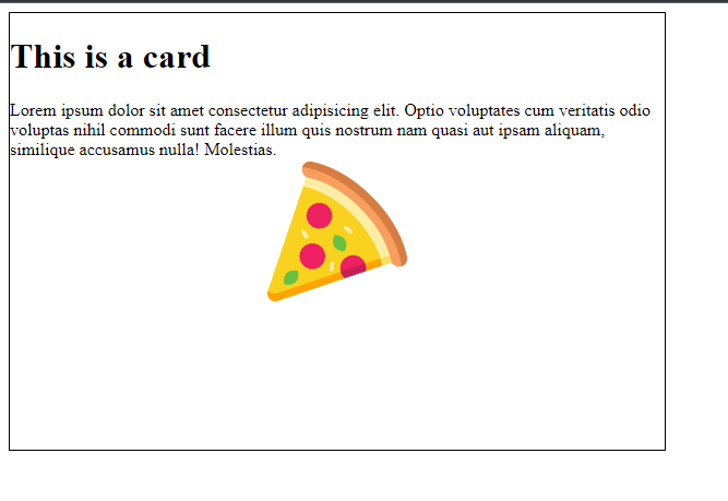
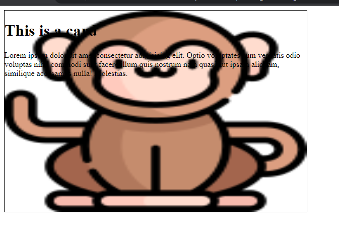
Background position:
The background-position property is used to set the position of image.
Example :
<!DOCTYPE html>
<html lang="en">
  <head>
    <meta charset="UTF-8" />
    <meta name="viewport" content="width=device-width, initial-scale=1.0" />
    <title>background-image</title>
    <style>
      .container {
        border: 1px solid black;
        width: 600px;
        height: 400px;
        background-image: url("https://cdn-icons-png.flaticon.com/128/3595/3595455.png");
        background-size: auto;
        background-repeat: no-repeat;
        background-position: center center;
      }
    </style>
  </head>

  <body>
    <div class="container">
      <h1>This is a card</h1>
      <p>
        Lorem ipsum dolor sit amet consectetur adipisicing elit. Optio
        voluptates cum veritatis odio voluptas nihil commodi sunt facere illum
        quis nostrum nam quasi aut ipsam aliquam, similique accusamus nulla!
        Molestias.
      </p>
    </div>
  </body>
</html>
Output :