Media Queries
Media Queries allow you to create responsive websites on all screen sizes from desktop to mobile.
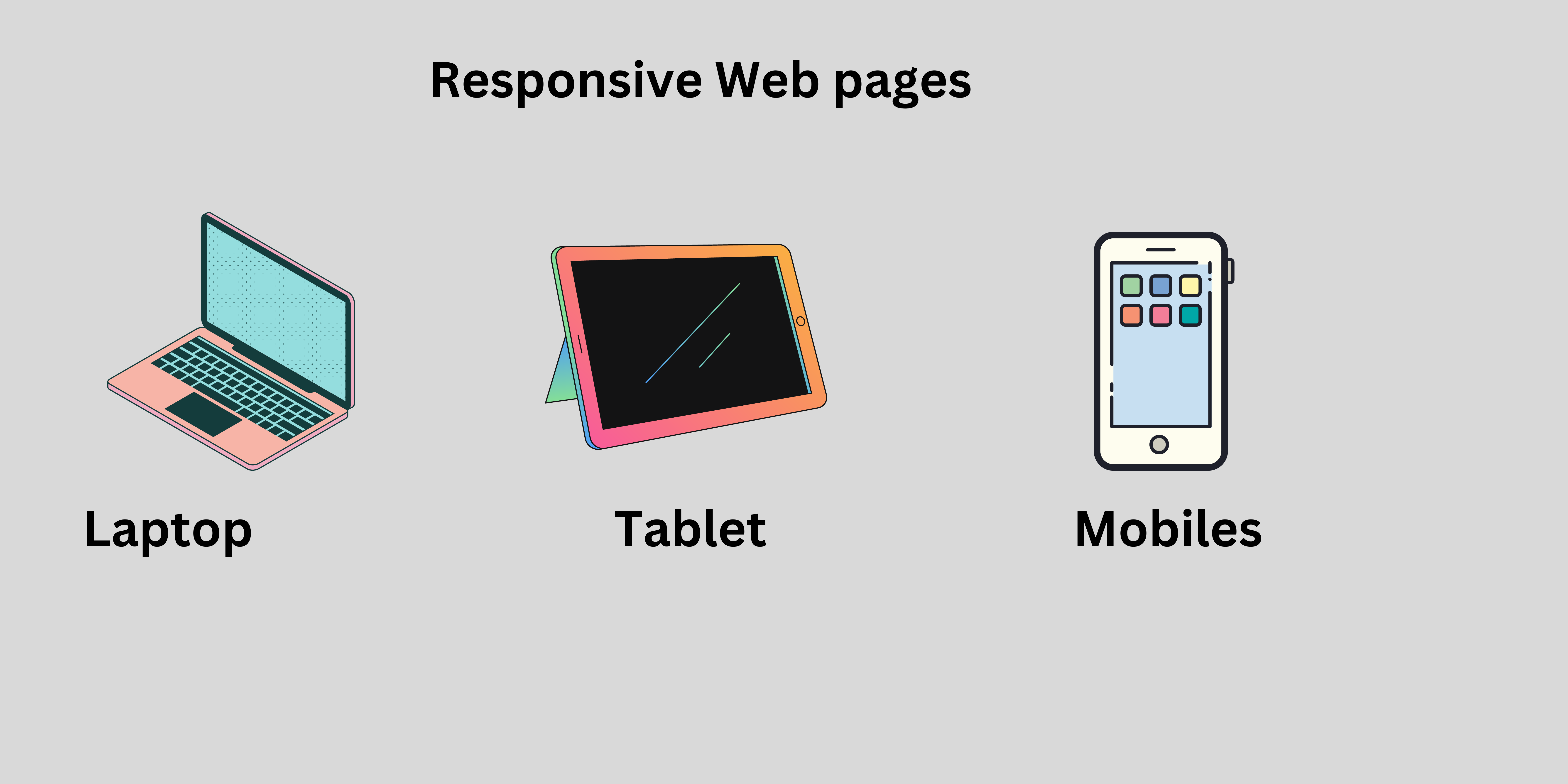
In a big screen you can show all possible elements.
In a small screen you can show only important elements.
For example :
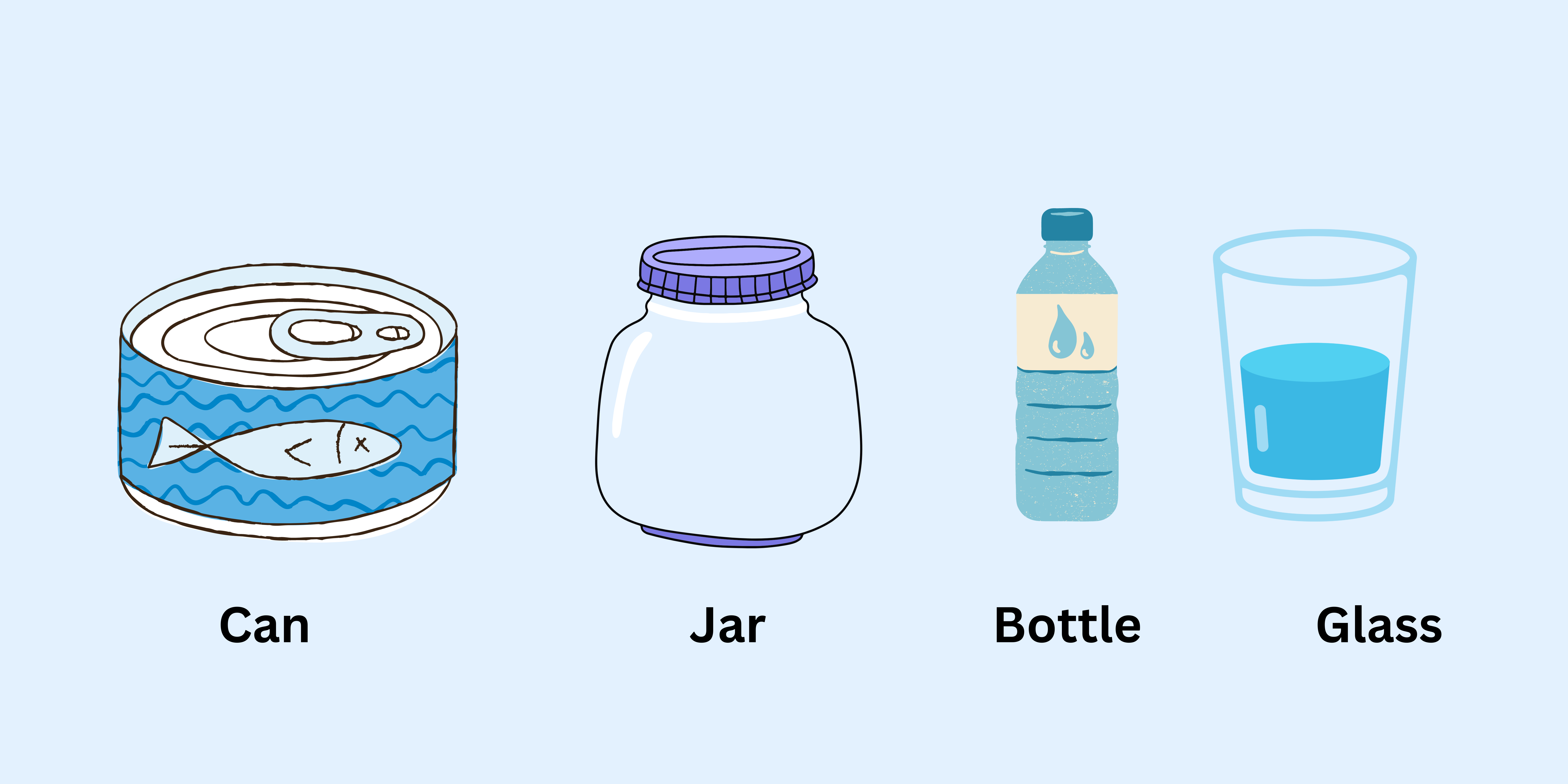
In the above example, we can store the water in different containers like can, jar, bottle and glass. The water takes the shape of a container like we can store the water in jar the water takes a shape of jar. Also we can store the water in a bottle, jar and glass the water takes the shape of a bottle, glass and jar. Same as our webpage. The webpage can be opened on different devices the webpage takes the shape of a device. Suppose a webpage is in a laptop then it takes the shape of a laptop that contains images and icons in the webpages.
Device Breakpoint
- Small mobile device : less than
600px - Normal mobile device : greater than
600pxand less than768px - Tablets : greater than
768pxand less than992px - Laptops / desktops : greater than
992pxand less than1200px - TV/Large desktop : greater than
1200px
Rules for creating website responsive:
Keeps the elements or cards horizontally on big screens. Arrange elements vertically on small screens.
Keep dimensions of text, images and buttons large on larger screens or small on smaller screens.
Use icons on smaller devices insted of text if possible.
- Media Query calculate
screen sizeand if it matches you passed screen size and media query screen size then media query will apply effect.
max-width
The max-width are specifies the maximum width of a particular device.
Syntax :
@media screen and (max-width: 600px) {
}
For example :
<!DOCTYPE html>
<html>
<head>
<title>Media Query</title>
<style>
.btn {
width: 400px;
height: 50px;
font-size: 20px;
background-color: tomato;
color: white;
}
@media screen and (max-width: 500px) {
.btn {
background-color: blue;
width: 300px;
height: 80px;
font-size: 40px;
}
}
</style>
</head>
<body>
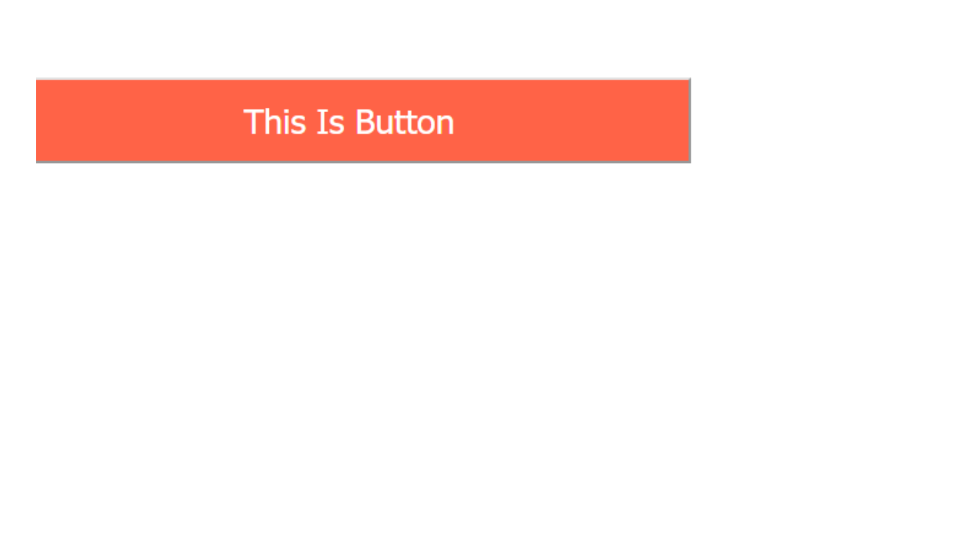
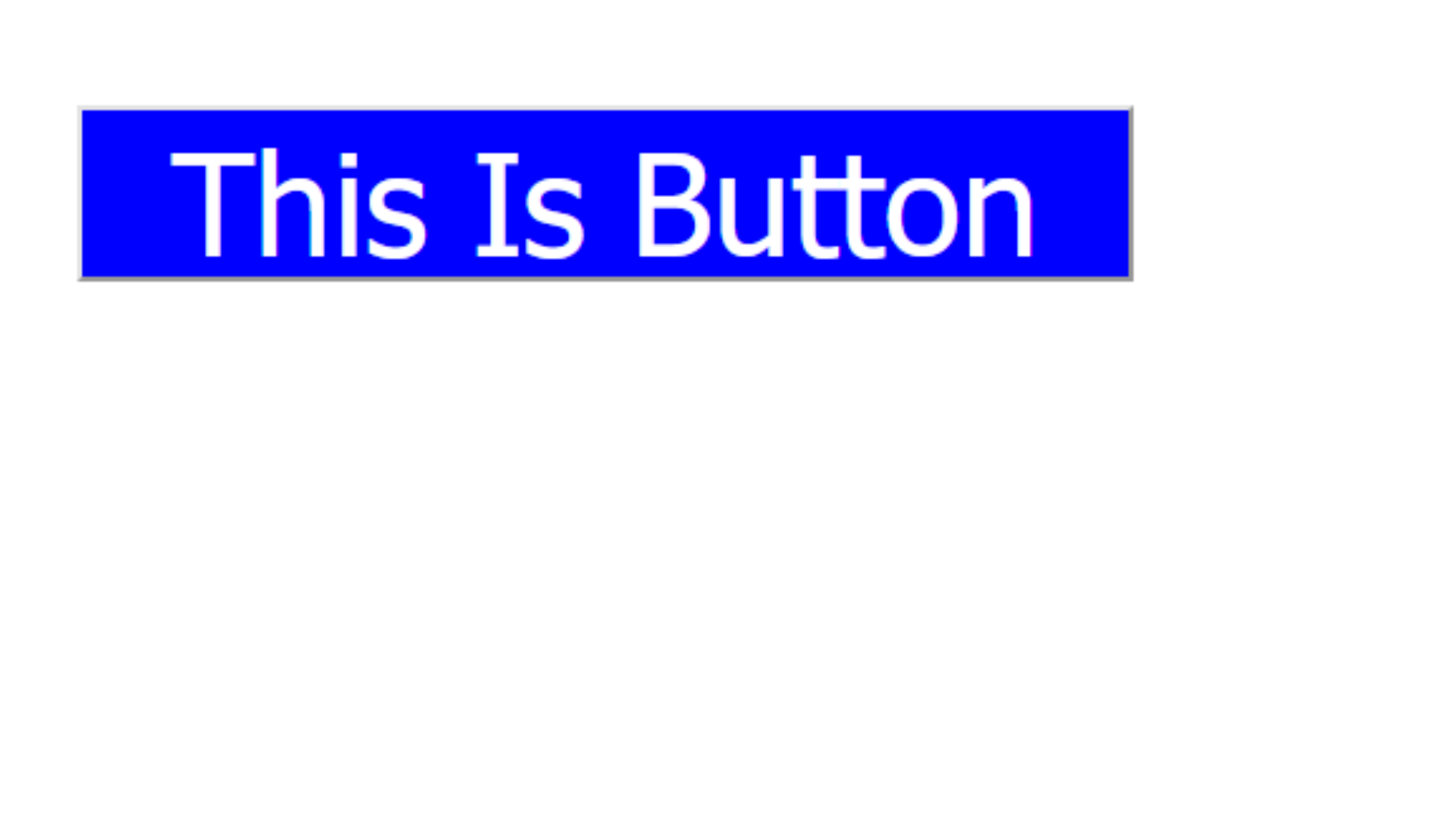
<button class="btn">This Is Button</button>
</body>
</html>
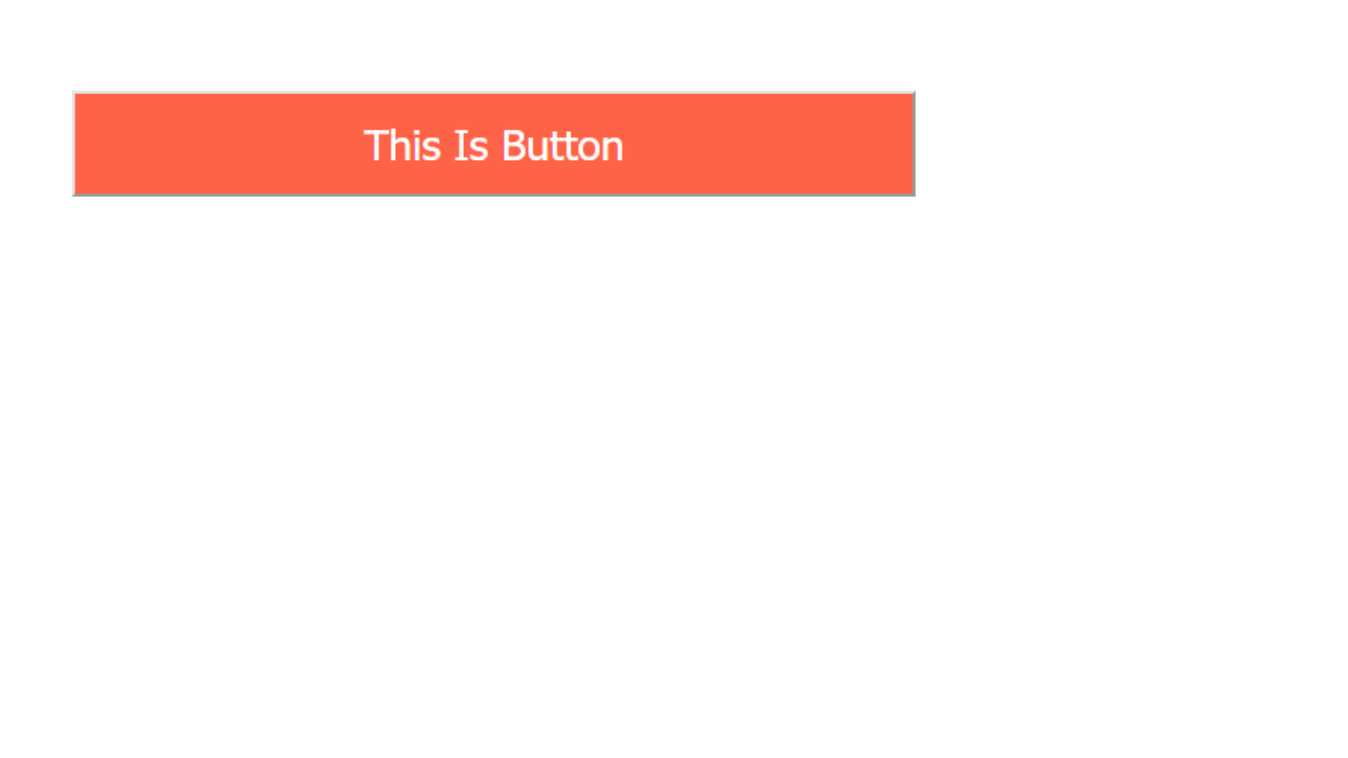
Output :
Normal Screen
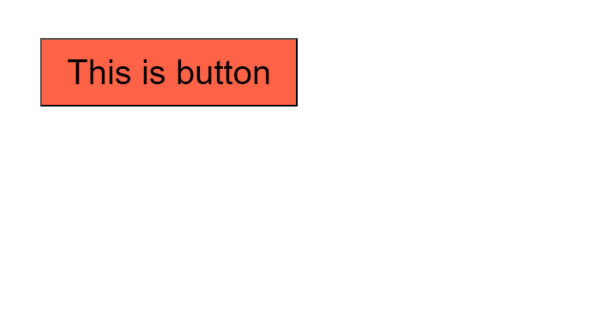
Screen size is less than 500px
Example explanation :
In the above example, in the normal screen 1st output will display and if the screen size is less than 500px then the media query effects will apply then that's the time 2nd output will display on the screen.
min-width
The min-width are specifies the minimum width of a particular device.
Syntax :
@media screen and (min-width: 600px) {
}
For example :
<!DOCTYPE html>
<html>
  <head>
    <title>Media Query</title>
    <style>
      .btn {
        width: 400px;
        height: 50px;
        font-size: 20px;
        background-color: tomato;
        color: white;
      }

      @media screen and (min-width: 600px) {
        .btn {
          background-color: blue;
          width: 300px;
          height: 50px;
          font-size: 40px;
        }
      }
    </style>
  </head>

  <body>
    <button class="btn">This Is Button</button>
  </body>
</html>
Output :
Normal Screen

Screen size is less than 600px
Example explanation :
In the above example, in the normal screen 1st output will display and if the screen size is less than 600px then the media query effects will apply then that's the time 2nd output will display on the screen.
min-width and max-width at same time
Syntax :
@media screen and (min-width: 600px) and (max-width: 800px) {
}
For example :
<!DOCTYPE html>
<html lang="en">
<head>
<meta charset="UTF-8" />
<meta name="viewport" content="width=device-width, initial-scale=1.0" />
<title>Document</title>
<style>
.btn {
background-color: tomato;
width: 300px;
height: 80px;
font-size: 40px;
}
/* Mobile Devices */
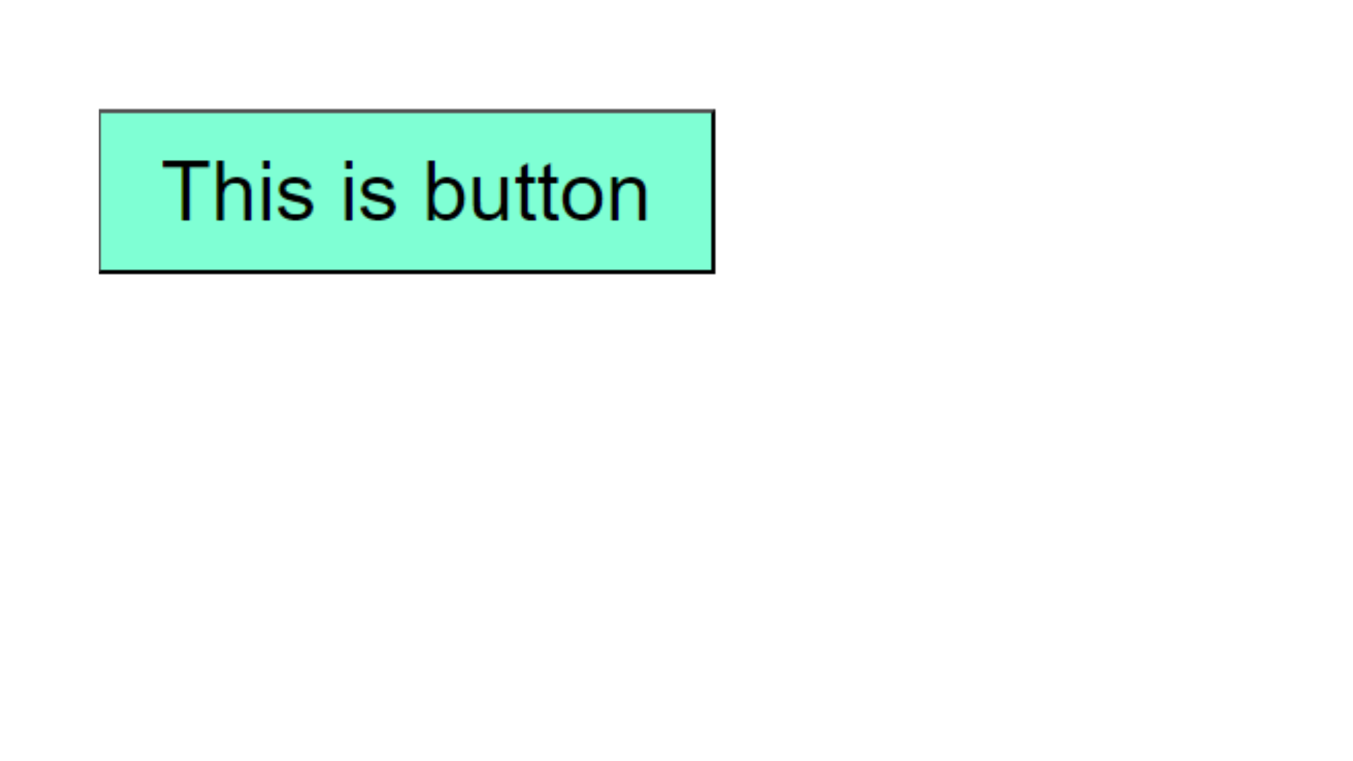
@media screen and (min-width: 600px) and (max-width: 768px) {
.btn {
background-color: aquamarine;
}
}
/* Tablet Devices */
@media screen and (min-width: 769px) and (max-width: 992px) {
.btn {
background-color: blue;
}
}
/* Dekstop device */
@media screen and (min-width: 993px) and (max-width: 1200px) {
.btn {
background-color: chartreuse;
}
}
</style>
</head>
<body>
<button class="btn">This is button</button>
</body>
</html>
Output :
Screen size is less than 600px
Example explanation :
In the above example, in the normal screen 1st output will display and if the screen size is less than 600px then the media query effects will apply then that's the time 2nd output will display on the screen.